
Table of Contents

The idea behind this article: this piece combines two useful things for anyone who wants to understand eYou seriously: a practical tutorial for the first days of using the platform and a technical look at how the product evolved from prelaunch to its current form.

I have followed eYou from its earliest version, so I am not only interested in the general vibe. What matters to me is the product journey: onboarding, interface clarity, content discovery, interaction flows, and the changes that became visible from one release to the next.

About me

If you want to follow along as the platform keeps evolving, you can find me on eYou as @safewiz. My public profile lives at eyou.social/u/safewiz, open it from a browser or the app to see what I post and to follow.

If you are not on eYou yet and want to join, you can use my referral link at www.eyou.social/r/safewiz. That way your account starts connected to my network, and it also counts toward the referral badges described earlier.

Now that Groups are live, I have also started one for this exact kind of ongoing discussion: Getting Started on eyou.social.

eYou Groups

This guide is also available in German: safewiz.eu/deguide. The German version was translated with AI assistance and then reviewed by hand; if you spot anything unclear or mistranslated, let me know.

German Guide

How to create your account and set up your profile

eYou account creation / login screen

I joined eYou in prelaunch because I wanted to understand the product before it became wrapped in broader public perception. At that stage, it is easier to see what is intentional and what is still under construction: where onboarding is clear, where flows are incomplete, and where the community still compensates for product limits.

Personally I think that the prelaunch was valuable for exactly that reason. I wanted to see the early version of the platform as a system, not just as a social space. I was interested in how the account is created, how quickly you understand where to post, how you discover relevant profiles, how visible the feed logic is, and how much the user still has to guess on their own.

That is the real value of following a platform from the beginning: you do not only see what it promises, you also see which product decisions leave a trace in the actual user experience.

The clearest way to evaluate an app is to follow the same path a new user would, in order: create the account, land on the profile page, set things up in Settings, come back and finish the profile, and only then explore the rest of the app. That is exactly the sequence the rest of this section follows.

If you want to create your account and you do not already have another creator or someone else’s referral link that you want to use, you can also join through my link: www.eyou.social/r/safewiz.

One detail worth knowing: after you click the referral link, the flow continues with downloading the app from the store. In other words, onboarding starts from the invite link, but it is completed inside the app after installation and first launch.

A small but welcome detail: you can now pick your language right on the sign-in screen, before you even create the account, so the rest of onboarding runs in your language from the start.

From my perspective, the natural order for a new user looks like this:

  1. Join through a referral link;
  2. Download the app from the store;
  3. Create your account inside the app; OR
  4. Use your Bluesky credentials to connect;
  5. Choose your username carefully;
  6. Only after that, move on to profile editing and complete it properly.

The username step deserves more attention than it seems to. Your username (handle) is one of the first elements that makes you easy to identify on the platform, so ideally it should be simple, clear, and close to the identity you already use online. If you already have a name people know from other platforms or from your own website, continuity helps.

Important: your username (handle) is unique and, once set, cannot be changed afterwards, so it is worth getting right the first time. It also cannot be recycled: even if you later delete your account, the handle stays reserved and is not released for anyone else to claim, which protects you and other users from impersonation through a freed-up name.

Once the account is created and the username is set, it is worth moving to the profile itself. This is where the part that shapes your first impression really begins.

Your profile screen

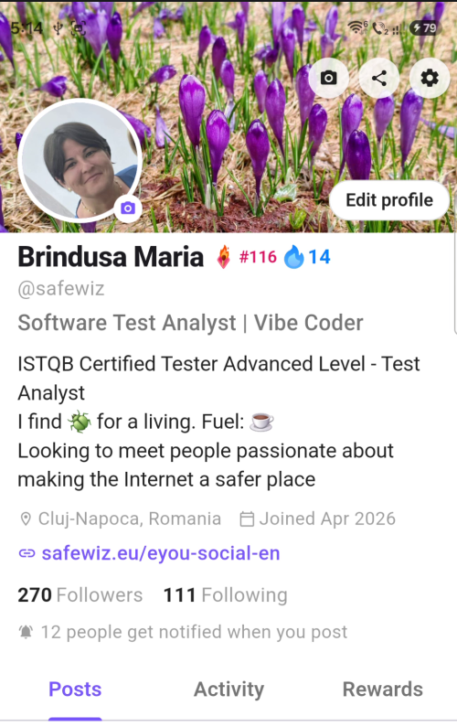
Main screen in the eYou app

Before editing anything, it helps to know how this screen is laid out, because almost everything tied to your presence on the platform starts from here:

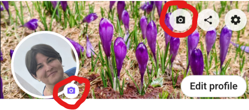
  • Camera, Share, and Settings icons: grouped together in the top-right corner of the banner. The camera icon opens picture and banner editing, Share produces your public profile link, and the Settings cog opens the app Settings, which is the first stop below.
  • Profile picture and banner: the header area. The picture is your round avatar, and the banner is the wide cover image behind it, which the app crops to a 2:1 ratio.
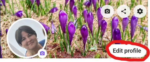
  • Edit profile: a floating pill button overlapping the bottom-right of the banner, opening the profile fields.
  • Followers, Following and the notified count: just under your bio and link. Followers is how many accounts follow you and Following is how many you follow; tapping either number opens your network view, covered in detail below. Below the counts, a bell line reads “X people get notified when you post”: the number of people who turned on the Bell for you, so they are alerted the moment you publish.
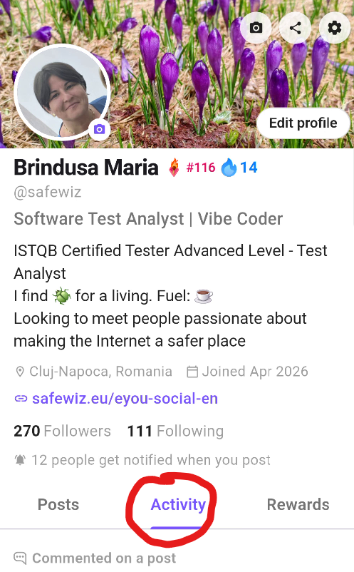
  • Posts, Activity and Rewards: the three tabs that organize your profile. Posts gathers everything you have published, Activity is a newer tab that brings your reposts and comments together in one place, and Rewards holds your badges. The earlier Quests tab (in-app challenges, never implemented) has been replaced by Activity.

With the layout clear, the most efficient path is to open Settings first, set up the experience, then come back to the header and the profile fields.

Network menu changes

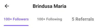
Tapping Followers or Following on your profile opens the same combined view, which groups three lists together: Followers, Following, and Referrals (the people who joined through you). As of v0.11.4, this is where that view lives: there is no separate Network tab anymore, it moved here after Groups took over its old spot in the bottom navigation.

Followers, Following and Referrals: reached by tapping either count on your profile, now that the separate Network tab is gone.

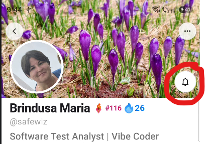
To be clear about what you are actually looking at on someone’s profile, here are the four possible states between your account and theirs:

  • Neither account follows the other: you see a plain Follow button, and no bell.
  • Neither account follows the other
    Neither account follows the other
  • One account follows the other, but not back: the follower sees a Following button on the other person’s profile. On mobile, this is the case that trips people up, because the app no longer shows a “Follows you” label on your own profile when someone follows you but you do not follow them back. That label existing before and being gone now is the whole source of the confusion: your follower count has not dropped, the badge that used to confirm it at a glance simply is not there anymore. You can only check to see whether that account name is listed in the Follower’s list or not.
  • One account follows the other, but not back
    One account follows the other, but not back

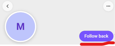
    However, the other account will see the Follow back button. Unfortunately due to the missing label in the first account, the following acton will only be reflected in the Notifications.

    The Follow back button
    The Follow back button
  • Both accounts follow each other, notification off: both sides see a Bell button, with no additional artwork on it. Please remember that seeing the bell does not guarantee that the other account follows you back.
  • Both accounts follow each other
    Both accounts follow each other
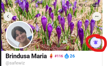
  • Notifications bell on: same as above, but with the notification bell artwork displayed so that side gets notified the moment the other posts.
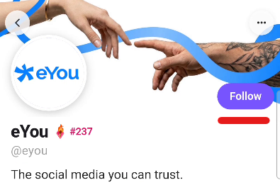
  • Notifications bell on
    Notifications bell on

Settings

From the Settings cog on your profile, you reach the account settings. This is where you can shape the experience from day one, so the app feels clearer and more comfortable for you.

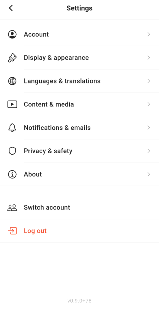
Settings received a major overhaul and is no longer a single flat list. It is now organized into clear categories, each opening its own sub-screen: Account, Display & appearance, Languages & translations, Content & media, Notifications & emails, Privacy & safety, and About, followed by Switch account and Log out below a divider.

The new Settings menu: Account, Display & appearance, Languages & translations, Content & media, Notifications & emails, Privacy & safety, and About, followed by Switch account and Log out.

Here is a quick tour of what lives inside each category, and what I would recommend checking first:

  • Account: Change password, Two-factor authentication, your Connected accounts (Bluesky), and Delete account. Set up two-factor authentication here if you have not already: it protects your account with an authenticator app through a simple step-by-step setup, and the app can autofill your 2FA code directly from your password manager so you do not have to switch apps and type it manually. As of v0.10.2, sign-in is smoother if you use multiple accounts: the two-factor prompt now shows which account it is for, so it is clear at a glance which one you are authenticating, and you can switch to a different account from that prompt without starting the whole sign-in flow over. Sign-in errors are also clearer now, with a proper retry screen if the process stalls instead of a dead end. This is also where you link a Bluesky account if you did not sign up with it directly, which can bring your profile picture across automatically.
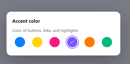
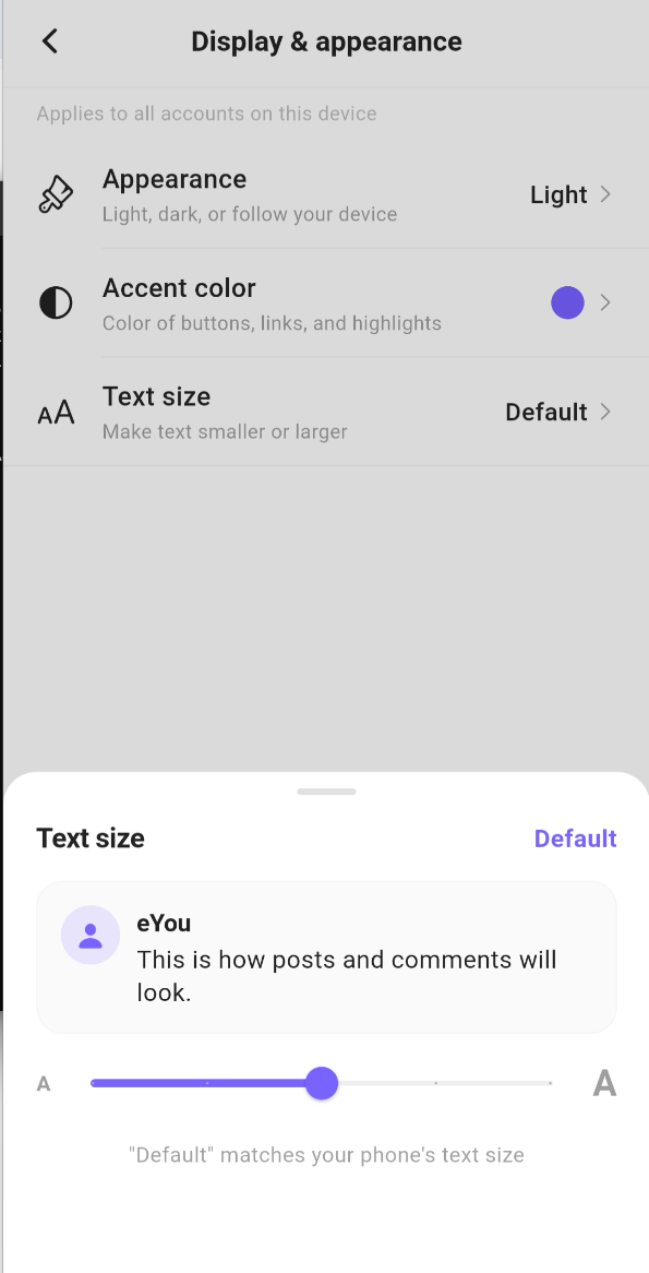
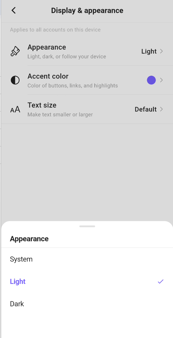
  • Display & appearance: Appearance (light, dark, or follow your device), a new Accent color picker with six colors for buttons, links, and highlights, and a new Text size slider with a live preview and a “Default” option matching your phone’s own text size. A small but useful label here: these are marked “This device” settings, meaning they apply to every account you use on that device, not per account.
  • Appearance in app
    Color accent in app
    Text size in app
  • Languages & translations: App language for the interface, Translation language for the language translated content appears in, and the Always show original content? toggle (note: this toggle is currently not working as expected; see the known issues at the end). Translated content itself is easier to work with now regardless: a cleaner See translation bar sits right above translated posts and comments, shows which language the content was translated from, and lets you jump into your translation settings on the spot, though that is a placement and clarity improvement, not a fix for the broken toggle.
  • Content & media: Post preview length (how much text appears in the feed before see more), Video visibility (where your videos appear), and Autoplay videos (when videos play automatically).
  • Notifications & emails: currently just the eYou newsletter toggle, for product news, announcements, and offers.
  • Privacy & safety: Blocked users, so you can review or manage who you have blocked.
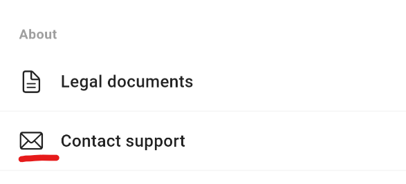
  • About: Legal documents and Contact support.
Below the seven categories, Switch account and Log out sit on their own, with the installed app version shown at the very bottom of the screen. This is worth checking early on if you want to understand how much control the app gives you over your account and how problems can be handled. eYou now also supports up to 4 accounts on the same device through Switch account, letting you move between them instantly without logging out and back in each time, useful if you want to keep a personal and a brand presence separate.
Profile picture and banner

Profile picture and Banner settings in the app.

Back on the profile home screen, the header is where you set your profile picture and banner. You only need to do this manually if your account was not created through Bluesky and is not linked to Bluesky from Settings. In those cases your name, bio, and profile picture are brought over automatically, so the header may already be partly filled in.

If you do need to set them, click on the camera icon. For the profile picture you can either take a new photo with the camera or choose one from your gallery, so make sure you grant the app the camera and photo permissions it asks for. The banner can only be selected from the gallery. After picking an image, adjust the framing before saving (cropping is noticeably faster now than in earlier versions). The banner especially is worth a deliberate choice, because it is the first large visual people see when they open your profile.

Edit profile

Edit profile.

The Edit action on your profile opens the editing screen. This is where you complete the fields that shape how people read you at a glance.

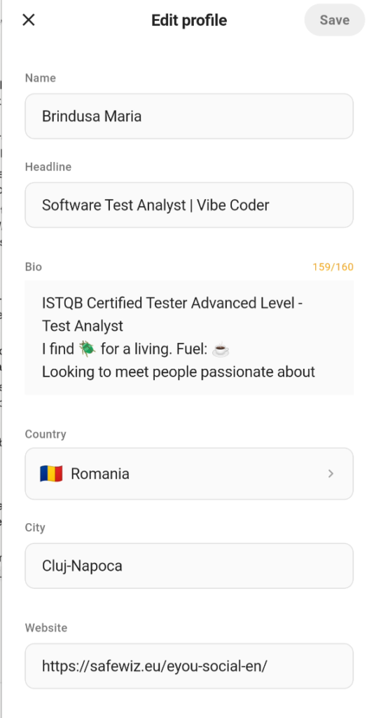
A practical example of profile setup in eYou: name, headline, bio, country, city and website.

On the profile editing screen, the most important fields are the ones that define you immediately: Name and Headline should say who you are quickly, Bio should stay short but effective, and Country, City and Website add context and credibility.

Separately from editing these fields, as of v0.11.4 you can also pin a post to the top of your own profile, so it is the first thing a visitor sees on your Posts tab, rather than whatever you happened to publish most recently.

What I recommend in a very practical sense at this stage:

  1. use a clear profile photo, not one that looks careless or hard to read;
  2. write a Headline that positions you immediately;
  3. keep the bio short, but specific enough to say who you are and what you talk about (max 160 characters);
  4. fill in country and city if you want stronger context and anchoring;
  5. add a relevant link to your website, portfolio, or link hub;
  6. treat the full profile as a business card, not as a form filled in a hurry.

Activity tab

The Activity tab is the newer of the three profile tabs, and it replaced the old, never-implemented Quests tab. Instead of challenges, it gives you a single place to see your own activity on the platform: your reposts and your comments gathered together, separate from the Posts tab, which only shows what you have originally published.

The Activity tab: your reposts and comments in one place.

In practice, this is a useful way to retrace your own footprint on the app: if you want to find a comment you left on someone else’s post, or a post you reposted a while ago, Activity is faster to check than scrolling back through your own Posts tab, which does not include that material.

This tab is public, so others can see your activity when visiting your profile.

Rewards tab

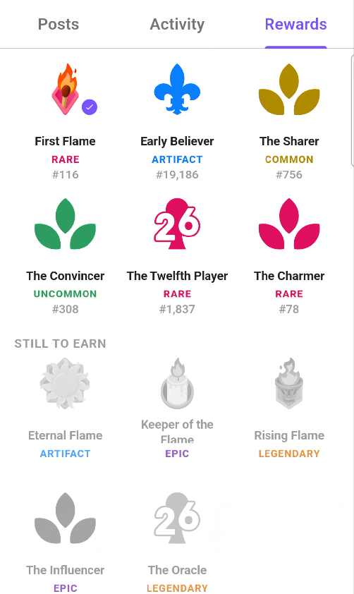
Badges are managed from the profile area, through the Rewards tab. This is where you can review the badges connected to your account, see what each one means, claim available rewards, and choose which badge should be displayed next to your name.

e.you badges that are ready to claim in Rewards.

The selected badge is not only decorative. It becomes part of the visible identity layer of the profile, including the profile header. If you earn more than one badge, the displayed badge can be changed later from the same Rewards area. As of v0.11.4, the Rewards case also previews badges you have not unlocked yet, not only the ones already in your collection.

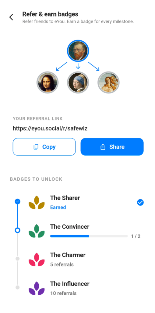
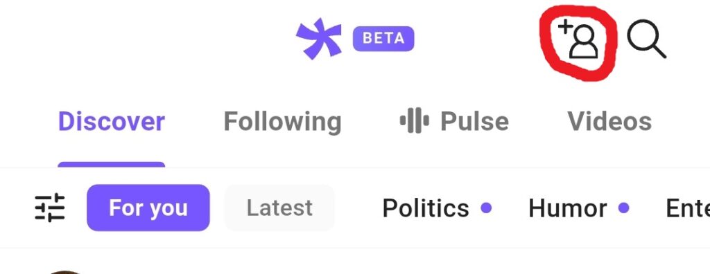
The referral program is already live on the home page and it also has a visible rewards layer. Once your account exists, you can use the invite button in the top bar to open your referral page, copy your personal link, and share it further.

As people join through your link, you move up a ladder of permanent badges that remain visible in the Rewards section.

Based on the current update, referral badges are structured across four levels: The Sharer for 1 referral, The Convincer for 2, The Charmer for 5, and The Influencer for 10. The referral page also shows a progress card so you can see how many invites you still need for the next level.

The Refer & earn badges screen: your referral link, the Copy and Share actions, and the badge ladder with live progress.

There is also a separate badge family tied to the very beginning of the project, before the app existed. Before the first screens and before the app launch, the team had a simple landing page and a waitlist. Between March 17 and April 24, around 50,000 people signed up based purely on the product promise. That early phase led to three recognition layers.

The first is The 300, for the 300 people who answered a founder survey posted on LinkedIn many months earlier, back when the project did not even have its final name. The second is Early Believer, for people who joined the waitlist between March 17 and April 24, before the app existed. The third is Early Supporter, for those who referred at least 10 friends to the waitlist and helped amplify the launch.

The important technical detail is that these badges are linked to the email address used when signing up for the waitlist. If your later eYou account was created with a different email, for example through Hide My Email or Apple’s private relay, the badge cannot be attached automatically. At the moment, only Early Believer from this badge family has been released. The 300 and Early Supporter are still expected, and the team also mentioned a future badge for active beta participants.

World Cup badges (time-limited, no longer obtainable)

Outside the referral and waitlist badge families, eYou has also shipped occasional, out-of-cycle badge drops tied to live events rather than referrals or tenure on the platform. The first of these landed around the 2026 football World Cup: on July 28, 2026, the official @eyou account announced “New badges just dropped. ⚽🏆 2026. You earned them. Now it’s time to claim them,” pointing users to Rewards to check their badge collection.

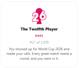
Two badges were shown in that announcement, tied to eYou’s official World Cup polls, and each rewarded something different: The Oracle, the rarer “legendary” tier of the two, went to the first 25 users who guessed the most exact match scores across those polls, a top-performer badge rather than one everyone could earn. The Twelfth Player went simply to those who participated in the polls, regardless of how accurate their guesses were. Both are tagged “26” for the 2026 tie-in. This was a time-limited drop, and the window to earn either badge has since closed. If you already have one, it remains in your Rewards collection like any other badge; if you do not, they are no longer obtainable.
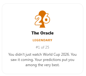
The Oracle legendary World Cup badge in the eYou Rewards tab
The Oracle: the legendary-tier badge for the most exact match-score guesses.
The Twelfth Player World Cup badge in the eYou Rewards tab
The Twelfth Player: awarded simply for participating in the World Cup polls.

The badges that were claimed still surface in the Rewards tab and can be selected to display next to your name the same way as the referral and waitlist badges. What this episode does confirm is that eYou is willing to run limited-time badge drops tied to live events, on top of the always-on referral and waitlist tracks, worth watching for if you want to catch the next one while it is still active. (Source: the official announcement post.)

One more topic note now that the tournament is over: the dedicated World Cup and Tour de France topics have wrapped up and are no longer separate categories in Discovering, and that content now lives under the general Sports topic.
Streaks

TL;DR: log in and do something in the app every day (comment, post, react, whatever counts) to build your streak. Miss a day and you are not automatically reset: freezes cover for you, and you win freezes by completing quests.

v0.10.2 introduced Streaks, an ongoing gamification layer on top of the badge system: stay active on eYou every day and you build a streak, tracked and displayed as a flame. Everyone started at zero on their first login after the update launched.

Everyone started at zero on their first login after v0.10.2 launched.

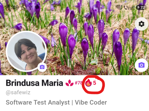
You access the Streaks page by tapping the flame icon next to your profile name, or the one on your Home page.

Flame icon on the Profile page.
Flame icon on the Home page.

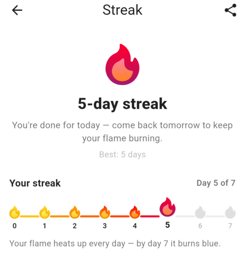
The Streaks page opens with your current count as a headline (for example “5-day streak”), a short status line telling you whether today is already secured (“You’re done for today, come back tomorrow to keep your flame burning”), and your personal best (“Best: 5 days”). A share icon sits in the top-right corner of the page itself, next to the back arrow.

The Streaks page: your current count, status, personal best, and a share icon top-right.

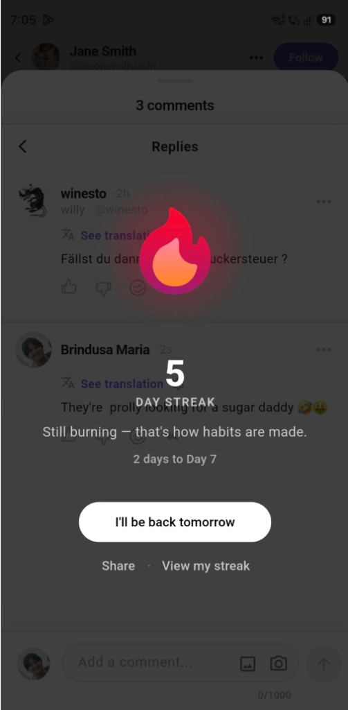
Whenever you complete an action that extends your streak, a “success streak” layover pops up on its own, confirming the day is secured and offering to share your progress right away, so you do not have to go looking for the share icon to broadcast a new day.

The success streak layover, triggered automatically after an action that extends your streak.

The Streak animation layover can be disabled by accessing your Settings – Content and Media and then toggle the Streak celebrations off.

The success streak toggle.

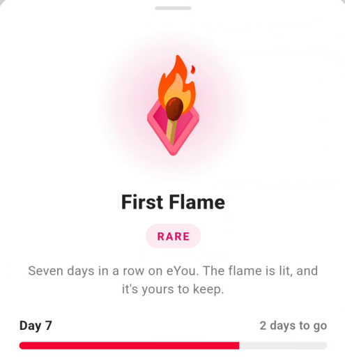
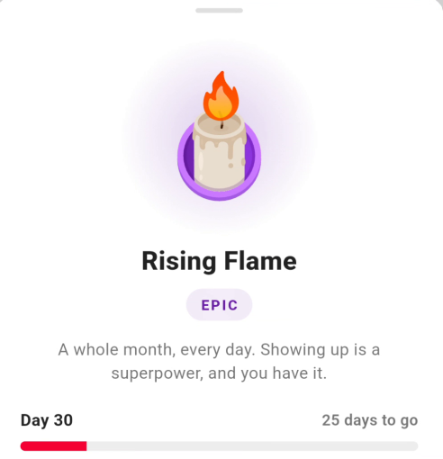
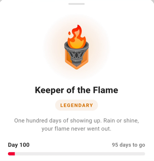
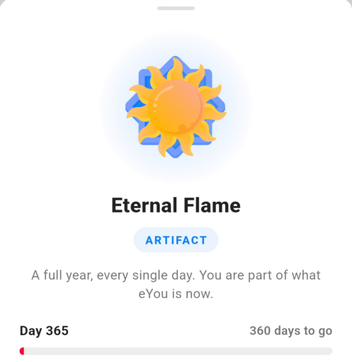
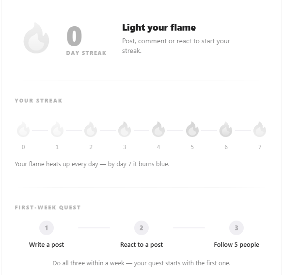
Below that sits a weekly flame meter. Your current streak is tracked against a x-day cycle, shown as a row of flame icons numbered 0 through 7 for the first range. Each day you keep the streak alive, the next flame lights up, and its color deepens the further along the week you are. The caption puts it simply: “Your flame heats up every day, by day 7 it burns blue.” So the meter signals your progress twice over: which day you are on within the week, and how “hot” your streak currently is. The cycle does not reset at day 7. The flame simply stays blue and keeps counting from there, all the way until your next badge tier kicks in: blue through to Day 30 (Rising Flame, the first Epic tier), then on to Day 100 (Keeper of the Flame, Legendary) and Day 365 (Eternal Flame, Artifact).

First Flame (Day 7).
Rising Flame (Day 30, Epic).
Keeper of the Flame (Day 100, Legendary).
Eternal Flame (Day 365, Artifact).

Below the flame meter sits your active quest card, and a preview of your next milestone badge further down.

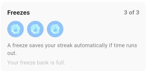
  • Quests, and how you win freezes: new streaks come with a First-week quest, a three-task checklist meant to get you using the app’s core actions early: Follow 5 people, React to a post, and Write a post, tracked as a simple “X of 3” counter, each task struck through and marked with a green checkmark as you complete it. The quest runs on a countdown (“3d 17h left” in the example shown) rather than being open-ended, and it is a one-time mechanic: it appeared for everyone who logged in for the first time after Streaks launched, and it does not repeat in later weeks. This is where freezes come from: a freeze is what protects your streak on a day you miss, instead of resetting to zero, a freeze silently covers for you and keeps the count going. Completing all three quest tasks earns a bonus freeze, confirmed by a green “Bonus freeze earned!” label once the counter hits 3 of 3. You can stockpile up to three freezes at a time.
  • The First-week quest card in the eYou app, showing three completed tasks and a bonus freeze earned
    The First-week quest: three tasks, a countdown, and a bonus freeze once all three are done.
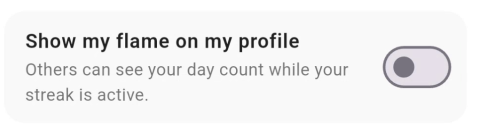
  • Badges and milestones: streak badges are tied to concrete day-count thresholds, previewed on the Streaks page itself as a “Next milestone” card showing the badge, its rarity, the day threshold, and a progress bar counting down (“3 days to go”), with a “Coming up” row previewing badges further down the road. Four thresholds are confirmed so far: Day 7 (First Flame), Day 30 (Rising Flame), Day 100 (Keeper of the Flame), and Day 365 (Eternal Flame). Rarity climbs with the tier: First Flame is Rare, Rising Flame (Day 30) is tagged Epic, with the flavor text “A whole month, every day. Showing up is a superpower, and you have it.” Keeper of the Flame (Day 100) is Legendary, and Eternal Flame (Day 365) tops the ladder at Artifact. Like other badges, each one also carries a personal edition number (for example “#5” on First Flame, meaning you were the 5th person to earn it), matching the format used for the Early Believer badge. Displaying your streak works differently from other badges, too: instead of selecting a badge to show next to your name, there is a dedicated “Show my flame on my profile” toggle, described as letting “others see your day count while your streak is active.”
  • The Show my flame on my profile toggle in the eYou app
    The “Show my flame on my profile” toggle.

Share your profile and the public feed

On your own profile, the Share action creates a profile link that can be sent outside the app. Shared profile links use the eyou.social/u/handle format. When opened from another app or browser, they are designed to take the user directly to the profile in eYou when the app is available.

Two links are worth keeping in mind once your account exists, because both make you easier to find and to share. The first is this public profile link, your shareable eyou.social/u/handle address.
The second is your invite link, the referral link eyou.social/r/handle reached through the invite button in the top bar: the referral link that adds new joiners to your network and moves you up the badge ladder in the Rewards section. In short, the public profile link is how people find you, while the invite link is how you grow your network and earn referral badges.

eYou: the referral invite button.

The bottom navigation bar

Once the profile is set up, the rest of the app is reached from the bottom navigation bar, which stays visible as you move around. It has five destinations:

  • Home: the main feed and everything related to posts: Discovering, Following, Pulse, and the Videos tab. This is where you spend most of your reading time, and it is covered in detail in the next section. A small but handy detail: tapping the tab you are already on (Home included) twice scrolls you back to the top, and this now works across tabs, not just on Home.
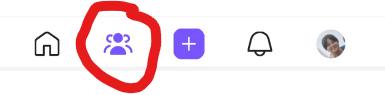
  • Groups: as of v0.11.4, this tab replaced the old Friends list slot; see the dedicated Groups section below for how it works.
  • Plus sign: the central button that opens the composer to create a new post.
  • Notification bell: replies, reactions, and alerts connected to polls, referrals, and rewards.
  • Profile: your own profile home screen, the same one set up above. This is also where your Followers, Following, and Referrals now live, since the old Friends list tab is gone; see Your profile screen above for exactly how to get to them.

How to use the app

Before publishing anything, I think it helps to understand how content moves inside eYou. In other words: where posts appear, how you influence what shows up in your feed, and how much control the app actually gives you over the experience.

The main feed or home screen.

Discovering: For You, Latest and the topics you choose

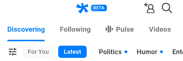
The important difference here is that eYou does not rely on the idea of a single generic feed. In the Discovering area, you get two separate flows: For You and Latest.

  • For You is the feed where the platform tries to surface content that is closer to your interests.
  • Latest is the chronological feed where you see posts in publishing order.
  • Topics or predefined categories make content discovery more structured than in a generic feed where everything is mixed together.

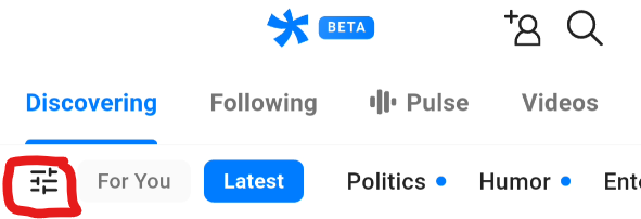
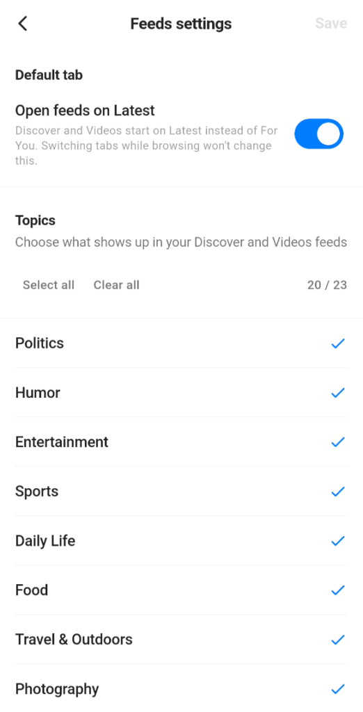
There is also a dedicated Discovering settings area where you can choose the default tab and manage the visible topic categories.

Discovering settings

The important behavior here is slightly different from a simple preference toggle. When a category is deselected, it is pushed to the end of the category list in this feed, and posts that fall under that category are hidden across the platform’s feeds, not only in Discovering.

Discovering settings: choosing the default tab and the topics that shape your feed.

At the top, a Default tab option with an Open feeds on Latest toggle lets you decide whether Discover and Videos open on Latest instead of For You; switching tabs while browsing will not change this default.

Put simply, that filtering also affects other content streams, including Pulse and Videos. For a new user, this section is worth checking early, because category selection does not just reorganize Discovering. It also changes which topics remain visible across the broader app experience.

Following

The Following tab is, in simple terms, where you see the content published by the accounts you follow. That makes it different from Discovering, where the platform mixes your chosen topics with the For You and Latest logic in order to suggest content.

Following becomes useful once you no longer want only thematic or exploratory discovery, but also a stable view into the people you already decided to keep up with. If you have found creators, professionals, or profiles that matter to you, this is the flow you come back to in order to track what they publish.

From a product perspective, its role matters because it separates two different logics: one of discovery and one of direct following. In Discovering, you look for what is new and worth exploring. In Following, you check the activity of people you deliberately chose.

For a long time, the missing piece here was notifications: if you wanted to stay up to date with the accounts you followed, you had to open the tab and check manually. That gap is now covered by a dedicated “Get notified” button, next to the Following button on a profile, for the voices you really do not want to miss. When that person publishes something new, you receive a notification that takes you directly to their post, with no algorithm or feed ranking in between.

Now this splits the following experience into two layers: the Following tab remains the browsing view for everyone you follow, while Get notified works as a direct line to the few people you deliberately choose to hear from immediately.

Remember to follow someone first; you need to be following an account before its Get notified button appears. Once clicked, it transforms into a notification bell icon.

The Get notified button: tap it to be notified the moment a followed account publishes.

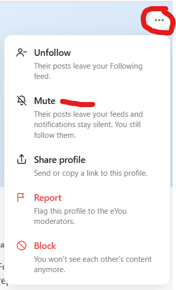
As of v0.11.4, you can also mute an account you follow directly from its profile, a lighter step than blocking: a muted person’s posts simply leave your own feed. Nothing is taken from their side and nothing is announced to them, so muting stays entirely on your end. Unlike blocking, mute only applies to accounts you actually follow.

Muting a followed account: their posts leave your feed, quietly and without a notification to them.

Pulse

The Pulse tab is a verified news stream coming from AFP and Reuters. That makes it quite different from the rest of the app, because here we are not dealing with user-generated posts, but with a separate editorial content layer.

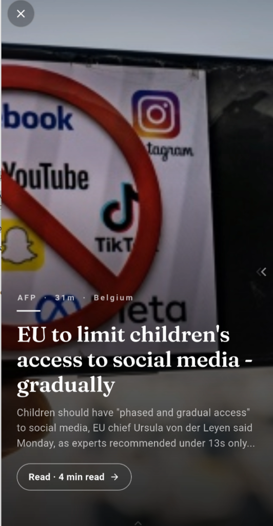
Since the redesign, Pulse no longer reads like a plain news list. The Briefing turns the verified stories into a magazine-style experience: you browse them as fullscreen covers, swipe down to discover the next story, or swipe left to open the complete article in a clean reading view. A progress line shows how much of the article is left, and when you reach the end, the next story is ready to continue.

What matters from a product perspective is that the more immersive design does not trade away verification: fact-check verdicts and community reviews remain visible throughout the experience, so context stays attached to the story even in fullscreen.

The Pulse Briefing: verified AFP and Reuters news as fullscreen covers and a clean reading view with a progress line.

Pulse can be customized through Categories. Deselecting categories will hide the respective content from the Pulse All feed.

Notice that the Share button on the articles is grayed out and inactive in the app, so a news article can only be reposted. On the web the Share button is hidden entirely. Open your account in the browser version and follow the Pulse article share instructions in the Web Guide.

One question that keeps coming up is whether Pulse will ever get translations. I asked the team directly, and here is their official response:

“As already explained here: Pulse is a service separate from eYou. Right now, the articles available there are in English, and eYou cannot apply the platform’s own translation feature to Pulse articles. On top of that, for journalistic content, automatic translation can alter certain nuances or even change the meaning of the wording, which is why that is not the solution the team chose. That is exactly why work is underway to expand Pulse into Romanian, French, and German, with local news written directly in those languages by local journalists, not plain automatic translations of the existing articles. So yes, there will be Pulse articles in Romanian. 😊 It is just that we are talking about developing a local version of the service, with its own journalistic content, not about automatically translating the AFP news you currently see in English. 💙”

Videos

With native video support, eYou now has a dedicated Videos tab: a full-screen, reels-style space for scrolling through video content on its own, separate from the mixed feed. Videos also play inline wherever they appear, so you can watch without leaving the post.

In fullscreen, the tab works as a vertical swipe feed: swipe up to move to the next video, with reworked playback controls that make the viewing experience smoother and easier to operate with one hand.

The experience is built to respect both your data and the original framing. Autoplay on scroll can be set to Always, Wi-Fi only, or Never, and video keeps its true orientation, so portrait stays portrait and landscape stays landscape instead of being squished or letterboxed.

The Videos tab: a fullscreen vertical swipe feed with reworked playback controls.

Search and notifications

Search, discovery, and connecting with other users.

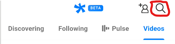
The search function in eYou is currently most useful for account names, not for discovering content by keyword. As of v0.11.4, one search finds people and Groups together, rather than people only.

  1. open the search area;
  2. type the account or group name, or part of it;
  3. check the results and open the right profile or group;
  4. from a profile, you can follow the account, review it, and see what it publishes; from a group, you can view its shell and join or request to join, depending on its privacy type.

What is worth stating very clearly is that this search does not work like a content search engine for posts or themes. If you want to find content about a topic, in practice Discovering, the For You and Latest feeds, and the selected topics help more than the search bar does.

Notifications button in the bottom navigation bar.

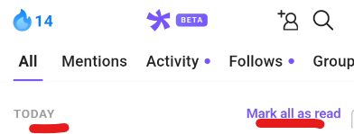
The notifications area also matters a lot in daily use. This is where you track who replied to you, who reacted, where a new interaction happened, and in more recent versions even notifications connected to polls, referrals, rewards, and Groups (see the dedicated Groups section for exactly which group events notify you). In practice, notifications are one of the fastest ways to return directly to the relevant conversation without manually searching through the feed. A reply notification now takes you straight to the exact reply inside its thread, not just to the post. Notifications also now cover the positive side of moderation: you get notified when your own post or comment has been reviewed and cleared, not only when something gets flagged. As of v0.10.2, @mentions in comments now reliably notify the person tagged, including on your own posts, closing a gap that previously meant some mentions could go unnoticed. As of v0.11.4, the notifications list has also been rebuilt: similar notifications are grouped together instead of listed one by one, entries are sectioned into Today, Yesterday, and older (in your own local time), and a row of filter tabs now sits at the top: All, Mentions, Activity, Follows, Groups, and System, with a small purple dot marking whichever tab has something unread. A Mark all as read link sits at the top-right of the list itself.

The redesigned notifications screen: filter tabs (All, Mentions, Activity, Follows, Groups, System), grouped entries, and Mark all as read.

One current limitation is worth flagging: at the moment there is no way to manage notifications from inside the app settings, so you cannot fine-tune which types you receive. If the notifications become too much, the practical workaround for now is to disable them for eYou from your phone’s system settings instead of from within the app.

Groups

Groups in the navigation bar.

TL;DR: Groups are spaces on eYou for people who share an interest, a city, a team, or a cause. Posting, commenting, and reacting inside a group works exactly like the rest of the app; what changes is who can see it and who looks after the space. Any user can create one. Groups shipped in v0.11.4, per eYou’s official announcement, and took over the bottom navigation slot that used to hold the Friends list (Followers, Following and Referrals moved to the Profile tab). Groups launched mobile-only and have since reached the web app too; see that guide for the web-specific details.

Every group is one of three kinds, chosen at creation: a private group can never later be switched to public, and neither can a public group become private or secret, the same protective approach Facebook uses for its own groups, since members post under a promise about who can see their words. The one exception is Private to Secret, which stays possible later on, since it only makes a group harder to find, not easier. If you pick wrong in a way that isn’t covered by that exception, the fix is to create a new group, not to flip a switch on the old one. See the dedicated How to create and admin your group section for the full breakdown of the three types, roles, and day-to-day mechanics.

How to create a post

Once you understand the Discovering and feed logic, publishing becomes easier to read. The post creation flow is straightforward, but it still comes with a few important limits and rules.

The post composer: text, images, and content preparation before publishing.
  1. tap the plus button to start a new post, or use Share to eYou from another app to send text, a link, a photo, or a video straight into a new eYou post (Android & iOS);
  2. write your text within the maximum limit of 3000 characters;
  3. you can add up to 4 images to a single post;
  4. videos can now be posted and play inline in the feed, with a dedicated Videos tab for browsing them full-screen;
  5. with draft support, unfinished posts can be kept and resumed instead of being lost when the composer is closed;
  6. after publishing, the post goes straight into AI moderation.

That changes expectations a little. This is not a simple “I post and instantly enter a distribution game” flow. It is more of a controlled pipeline where the product keeps moderation in place before the post fully continues its path through the platform.

It is worth preparing your text properly from the start: know what you want to say, verify your links, and choose relevant visuals, treating the 3000-character limit as a useful editorial constraint rather than a problem. The old 15-minute edit window is gone as of v0.10.2: you can now edit a normal post anytime after publishing, not just in the first few minutes. An edited post carries a small “edited” marker, so the change stays transparent to anyone reading it rather than being silently rewritten.

Important: eYou does not seem to punish external links the way many other social platforms do.

Content moderation: automated flag, human review

Every post is first checked by an automated moderation system. If nothing is flagged, the post simply lives on the platform, most posts never reach a human at all. Only the posts the automated system flags are then looked at by a human moderator, who either confirms the flag and removes the post, or overturns it if the automated system got it wrong.

This step is not about agreeing or disagreeing with an opinion. It targets recognizable spam and scam patterns, for example a vague financial opportunity paired with recruitment-style phrasing such as “contact me for details,” “looking for serious people,” “bonus,” or online-income promises. When a human moderator reviews a flagged post, they see the same content and the same reasoning the automated system used, and can either agree with it or reverse it.

Whenever a post is rejected after human review, the author is told the reason for the decision. This has nothing to do with fact-checking accuracy (see below): it is the platform enforcing its anti-spam and anti-scam rules to keep the community safe.

Fact-checking and how to challenge it

Separately from content moderation, posts also pass through automated fact-checking. The system reads the content, evaluates factual claims, and can attach a fact-check with a confidence score and an accuracy label. The aim is not to silence opinion, but to flag claims that could mislead, while leaving casual language, humor, and normal conversation alone.

As mentioned above, every post passes through AI moderation after publishing. The system reads the content, evaluates factual claims, and can attach a fact-check with a confidence score and an accuracy label. The aim is not to silence opinion, but to flag claims that could mislead, while leaving casual language, humor, and normal conversation alone.

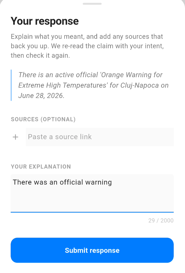
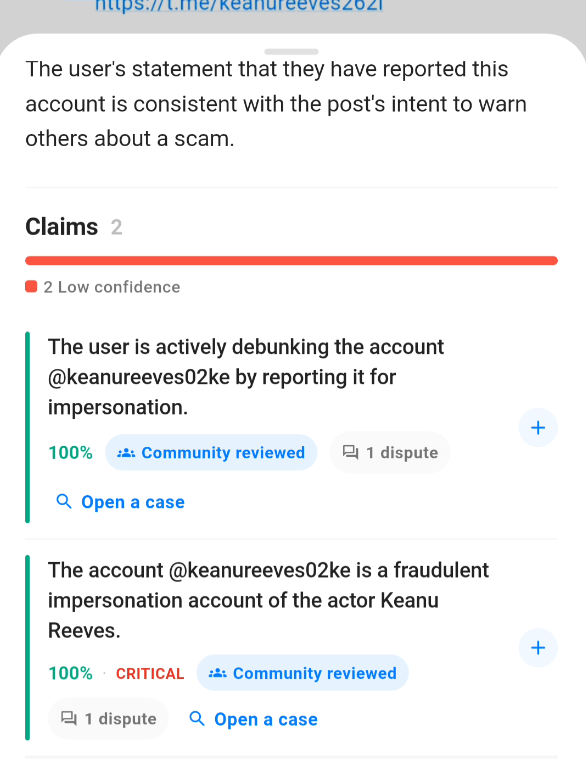
The important part is that this is not a dead end. If a fact-check gets your post wrong, you can open a case and dispute it. This opens a Your response panel, where you explain what you meant and add anything that backs you up. The system then re-reads the claim with your intent and checks it again, so the dispute is an actual re-evaluation rather than a complaint that goes nowhere.

Challenging a fact-check: Open a case.

A case is built from two inputs:

Challenging a fact-check: Your response panel with the flagged claim, an optional source link, and your explanation.
  • Source (optional): a link you paste in to back up your claim. It is not required, but a credible source makes the strongest case. The panel shows the exact claim that was flagged so you know precisely what you are responding to.
  • Your explanation: up to 2000 characters where you say what you actually meant and why the confidence is wrong, citing sources if you have them.

Once both are ready, you tap Submit response and the claim is checked again with your context taken into account. This dispute flow ties into the community-driven fact-check review introduced in the latest version, where unverifiable claims are marked clearly instead of being given a misleading score.

There is now also a reward for being right. When your dispute actually changes a verdict, you receive a “Proven right” credit, so successfully correcting the system is recognized rather than passing unnoticed.

The “Proven right” credit awarded when your dispute changes a fact-check verdict.

NOTE The cases are nominal, meaning that your name will be listed on the challenge. There were requests to make these disputes annonymous, but there is no timeline for this change yet.

Reporting

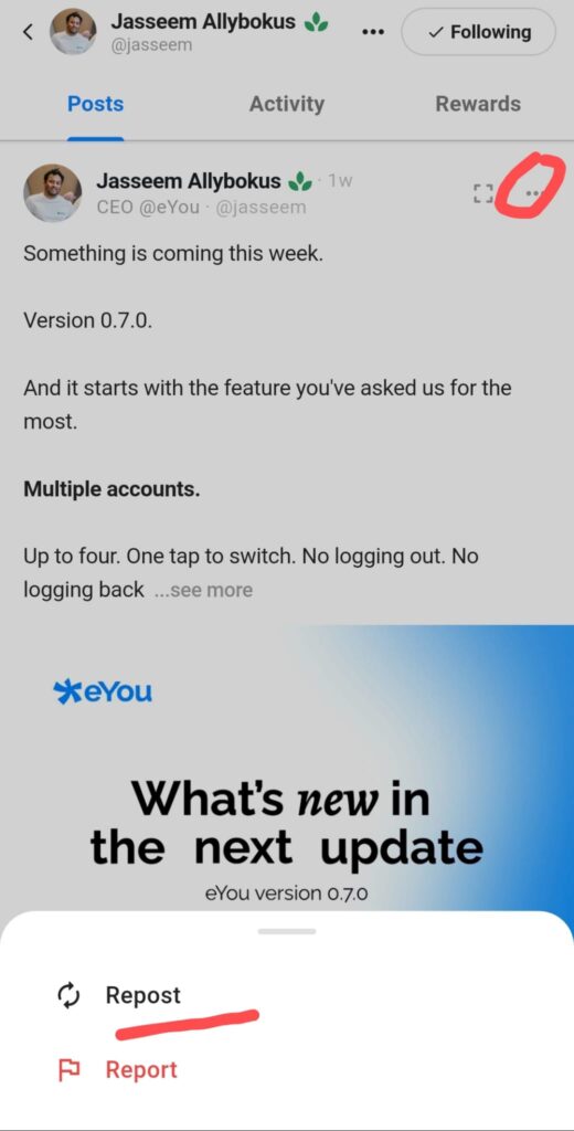
The third, independent pipeline is user reporting. Any post (and, as covered below, any comment or reply) can be reported by other users. Reports are also reviewed by a human, separately from both the automated moderation flag queue and the fact-check system. Reporting exists for content that other systems might miss: it is community members flagging something for review, not an automated system or a fact-check dispute.

The report sheet itself got a usability fix: it no longer covers the full screen, the details field you fill in stays visible while you type, and the submit button is clearer, so filing a report is less fiddly than it used to be.

Reposting

The Repost button sits in the same action row and gives you two ways to pass a post along to your own followers. Tapping it opens a small menu with two options: Repost, which shares the post instantly into your followers’ feeds exactly as it is, and Repost with your thoughts, which creates a new post of your own with the original post attached underneath, so you can add commentary above it (a quote-repost, in other words). Reposts you make show up together with your comments in the Activity tab on your profile.

The Repost menu: a plain repost, or a quote-repost with your own thoughts attached.

Reactions, emojis and the post action row

The interaction layer under a post is split into clearly separated actions. The older like/dislike mental model is better read in the current interface as Agree and Disagree: quick reactions that communicate direct alignment or disagreement with the post.

The emoji reactions sit separately and work as a more expressive layer. They let users react emotionally without reducing every response to a simple positive or negative signal.

Reactions are now easier to read at a glance. They appear above the action bar, with a named summary such as “Marie and 4 others,” so you can see who engaged without opening a separate list. The reaction emojis are also shown directly on comments and on news article cards, giving more context across the app rather than only under a post.

With the newer post button organization, Share is also part of the action row. That makes sharing a post more visible and more consistent with the other post-level actions. Shared post links use the /p/post pattern and are meant to open directly in eYou when possible.

Pictures and Videos

Photos and Videos buttons in the create post window

A post can carry visual content as well as text. You can attach up to 4 images to a single post, and uploaded GIFs keep their animation. When you add several images, each preview shows its position in the sequence, which makes the visual composition easier to control before publishing.

When you open an image or video fullscreen, it now rotates with your device’s physical orientation, so turning your phone to landscape actually turns the media instead of leaving it locked in place. This respects your rotation lock too: if you have it turned on, eYou will not force a rotation against it.

Since the video update, videos can be posted directly and play inline in the feed, with a dedicated Videos tab for browsing them full-screen. This removes the earlier limitation where only external video links could be used.

Tapping a photo, video, text post, or the fullscreen icon opens Immersive Mode: a distraction-free view you can swipe up in to move straight to the next post, without going back to the regular feed first. Photos open in a fullscreen gallery with zoom and multi-image browsing, videos play edge to edge, and text posts get a dedicated reading layout, short posts as visual posters, longer ones with clearer typography and more comfortable spacing.

Polls

Polls are one of the newer features worth watching closely, because they do not only add another post format. They also create a clearer way to measure where the community stands on a concrete question.

Polls button in the create post window

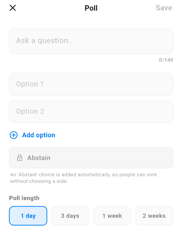
At the structural level, the product is simple: you add a question, choose up to 4 options, and set a duration. That is the core structure. From there, people answer, and the result becomes a real signal about community sentiment.

One important detail to keep in mind before publishing: unlike a normal post, a poll cannot be edited at all once it is live. The question and the options are fixed the moment you post it, with no edit window, so it is worth double-checking the wording and the answer choices before you publish.

Polls modal

With the newer poll updates, live poll results refresh automatically, and there is also a manual refresh button. That makes polls easier to follow while they are active, especially when several people are voting at the same time.

What is interesting is that the feature does not seem designed only as an engagement tool, but also as an interaction design decision. Based on the product description, the vote is treated as anonymous, including from the poll author. In other words, the system keeps the one person, one vote logic, but does not turn voting into a public list of names and choices.

There is also a useful mechanism against herd behavior. While the poll is still open, you can see that activity exists and that people are voting, but you do not immediately get the full breakdown before you engage yourself. The idea is clear: late voters should not automatically drift toward an option just because a visible favorite already exists.

From what has been communicated so far, each user gets three actions on a poll: cast a vote, change it once, then change it again. After that, the vote becomes locked. On top of that, the order of the options can shuffle between views so that the first option does not automatically gain a positional advantage.

The most interesting detail, though, is the built-in Abstain option that appears on every poll. It is not just the equivalent of “I did not vote”, but an explicit form of participation without accepting the options offered. In other words, you are saying: I saw the question, I want to engage, but I do not choose any of the answers you gave me.

In broader terms, that resembles the logic of a blank vote in democratic processes. It is not absence. It is a position. And inside the product, that matters because the user is not forced into a binary or into a closed answer set simply because that is how the author framed the question.

In terms of practical use, polls can be strong for quick feedback, idea validation, opinion testing, conversation starters, or simply for seeing which themes actually mobilize the community. It remains to be seen whether they will be used more for real discussion or for easy engagement, but as product mechanics they are one of the more interesting recent additions.

Comments, replies and reporting

Comments have their own interaction flow, separate from post reactions.

The threading itself is now clearer. Replies open in a dedicated thread panel instead of being buried under the parent comment, reply references are easier to follow, and a reply notification takes you directly to the relevant reply. Comments also read in a more natural order, from oldest to newest, so a discussion follows the way a real conversation unfolds rather than starting from the most recent line. As of v0.10.2, new comments also load automatically as you scroll, so you no longer need to tap to see the next page of a busy thread.

Replies open in a dedicated thread panel, with comments ordered from oldest to newest.

The comment composer is more capable than it first looks:

  • Character limit of 1,000: a comment can run up to 1,000 characters (raised from the earlier 600), with a live counter showing how much room is left as you type.
  • Pictures in comments: you can attach an image to a comment through the camera button built into the composer, so a reply is no longer limited to text.
  • Emoji reactions: besides Agree and Disagree, comments can carry emoji reactions, which keeps opinion separate from a more expressive emotional response.
  • Reporting: both comments and their replies can be reported, so moderation reaches every level of a thread, not just the original post.
  • Hiding comments on your own posts: as of v0.10.2, post owners no longer delete comments outright, but can hide them instead. See the dedicated section below for how it works and what it does and does not do.

Hiding comments on your own posts

This replaced outright deletion in v0.10.2, following a community vote that landed decisively in favor of hiding over erasing. As the post owner, you can now hide any comment left under your own post, instead of deleting it.

What actually happens when you hide a comment:

  • the comment collapses into a placeholder in the thread instead of showing its text; other readers see a crossed-out eye icon and the label “Hidden by the author”, with a Show link next to it;
  • nothing is deleted or lost: any reader can tap that Show link to reveal the original comment underneath;
  • the view is different for you as the author: you do not see the Show link readers get, but you do have the option to unhide the comment, so hiding is reversible on your end;
  • it only applies to your own posts: you can hide comments left under content you published, not comments on other people’s posts, that is what reporting is for;
  • it is a separate action from reporting: hiding is about curating the conversation under your own content, while reporting sends the comment to the platform’s moderation queue for review against the rules.
A hidden comment as readers see it: “Hidden by the author”, with a Show link to reveal it.

What this entitles, in practice, is a middle ground between doing nothing and outright deletion: you get to keep a comment you disagree with, dislike, or find off-topic out of view under your own post, without silently erasing someone’s words the way the old delete function did, and you can change your mind and unhide it later. The record stays intact for anyone willing to tap and look.

A few more practical details worth knowing: hiding a comment sends no notification whatsoever to the commenter, so they will not find out unless they revisit the thread themselves; a hidden comment still counts toward the post’s visible comment total, it is only the text itself that is collapsed from view; and the comment still shows up normally in the commenter’s own Activity tab, with no note or flag there indicating it has been hidden elsewhere. So from the commenter’s side, everything looks completely ordinary unless they go looking at the post itself.

How to create and admin your group

Creating a group

Setting up a group takes a few steps, and because the privacy choice is permanent (see the Groups section above), it is worth deciding public, private, or secret before you start filling anything in.

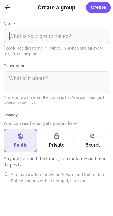
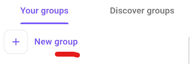
  1. start creating a new group by clicking New group
  2. Creating a new group in the eYou app
    Creating a group.
  3. choose Public, Private, or Secret: this cannot be changed later, so pick carefuly (unless you want to switch from Private to Secret later on);
  4. give the group a name and a description;
  5. optionally add a cover image, which goes through the same size, format, and automatic moderation checks as a profile banner before it can be published;
  6. you become the group’s first admin automatically once it is created.
Creating a group: name, description, privacy choice, and an optional cover image.

What each of the three types actually means in practice:

  • Public: anyone can find it, read it, and join in a tap. Its posts can surface in both the Discover and Latest feeds, carrying a small “posted in …” chip, and can be reposted like any other content: anyone whose feed is set to show that kind of content will see it.
  • Compared to the Facebook years, when our own posts could quietly get buried as “irrelevant” by the algorithm, this feels like exactly what we were asking for. No?
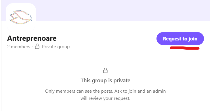
  • Private: people can see the group’s public “shell”, its name, description, cover image and member count, so they can find it and ask to join, but an admin has to let them in (or invite them directly). The posts, comments and reactions inside are strictly member-only: to a non-member, a private-group post effectively does not exist anywhere on eYou, not in feeds, not in search, not in the Activity tab, not at a direct link, and it cannot be reposted, commented on, or reacted to from the outside.
  • Secret: a private group that also stays out of search and out of Discover entirely. Visiting its address directly tells a non-member there is nothing there, rather than refusing access, since a refusal would itself confirm the group exists. Joining works the same way as a private group, by request or invitation from an Admin.
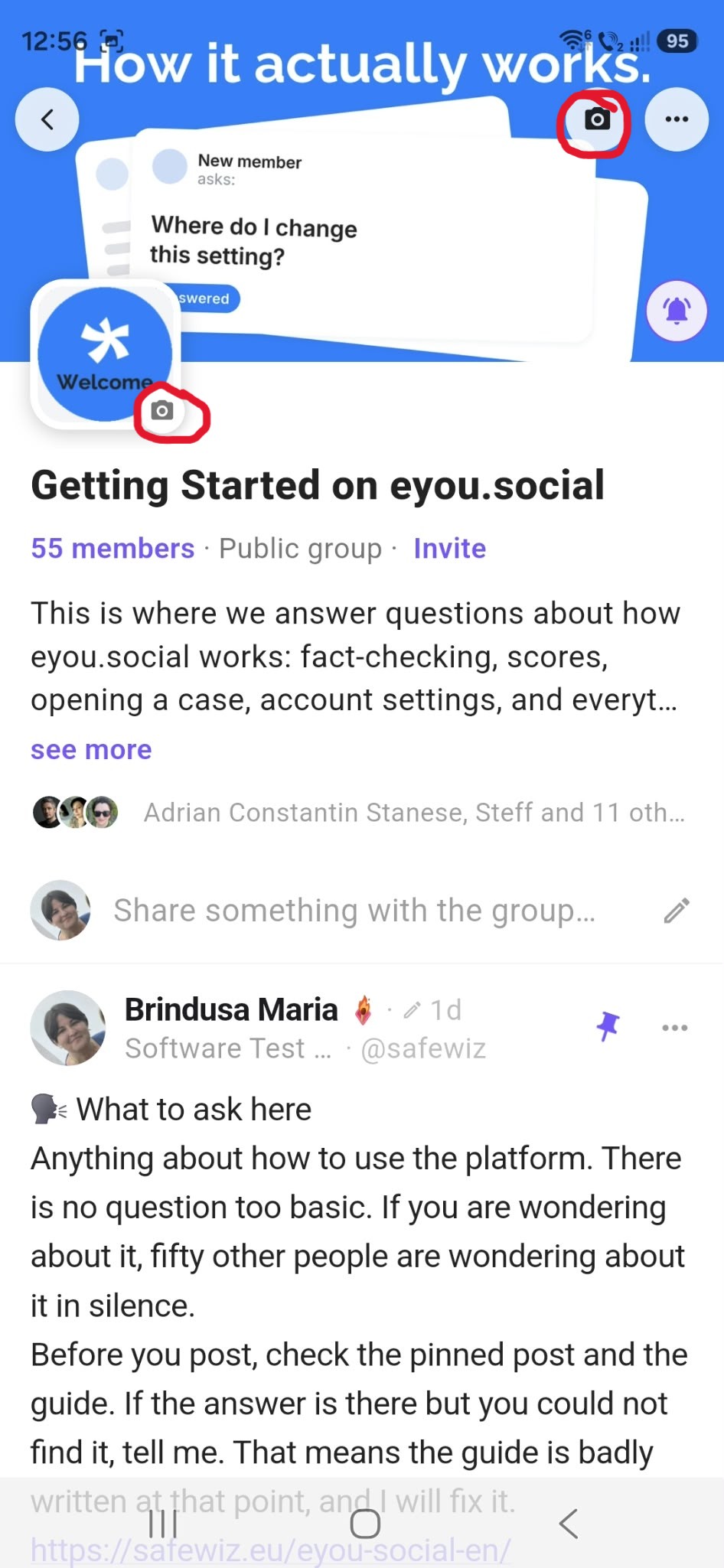
  • Setting the Group Banner and Avatar images menu
  • A group page in the eYou app, showing its shell and posts
    A group’s page in the app: the shell (name, description, cover, member count) plus its content underneath.

Congratulations on creating your group!

One confusing point worth clearing up, since it has genuinely confused people: when you post inside a private/secret group, that post still shows up on your own profile exactly like all your other posts because you are a member of the said group. Looking at your own page, you cannot tell it apart from a fully public post, and it is easy to worry that you have accidentally shared something with everyone. You have not. That familiar look is only for you. For anyone who is not a member of that group, the post simply is not there: not on your profile as they see it, not in their feed, nowhere they could stumble across it. So yes, it looks public when you check it yourself, but it truly is not.
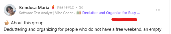
On your own profile, a private-group post looks exactly like any other post of yours; non-members never see it at all.

Administrating a group

From there, administrating the group is where the day-to-day work happens. As an admin, you can:

  • Handle membership: approve or reject join requests on a private or secret group (rejections are silent; the requester can simply try again later), or invite people directly (an invite just needs to be accepted, with no separate approval step).
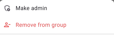
  • Manage the roster: remove a member (removal is not a ban, they can rejoin or be re-invited later), and promote a member to admin or demote an admin back to member. Select the user from the roster and apply the action.
  • Open the Group's member list
    Open the Group’s member list.
    Make admin or remove member
    Make admin or remove member.
  • Edit the group itself: update its name, description, and cover image at any time.
  • Curate the feed: pin one post to the top of the group, and hide a post (and unhide it later), using the same gentle approach as hiding a comment.
  • Close it down: archive the group once it has run its course, turning it read-only.
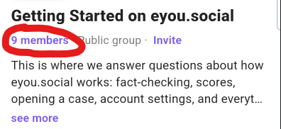
A group's admin panel: membership, roster, and moderation controls in one place.

Roles inside a group are kept simple: members can post, comment, react, see everything, and leave whenever they want; admins can additionally approve or reject join requests, invite people, remove members, promote members to admin or demote them, edit the group’s name, description and cover image, pin a post to the top of the group, hide a post inside the group, and archive the group. Whoever creates a group becomes its first admin, marked with a Owner icon so members can immediately tell the owner apart from any admin promoted later. A group is never left without an admin: the last remaining one has to promote a successor, or archive the group, before they can leave or step down. If a lone admin’s account is banned or deleted instead, eYou automatically promotes the group’s longest-standing member to admin so the group keeps someone responsible; if no members are left at all, the group is archived instead.

Inside a group, day-to-day behavior gets a few dedicated touches: every post carries its own group chip, so you always know at a glance where a conversation lives; an admin can pin one post to the top so it is the first thing members see; and in a private (or secret) group, @mentions in a comment only suggest people already in the room, not the whole platform. Search now finds people and groups together in a single search, rather than people only. And a public group’s posts are fact-checked exactly like everything else on eYou; group content does not get a pass on the platform’s usual verification just for living inside a group.

Admins can also tidy up their own group by hiding a post inside it, the same gentle approach used for hiding comments elsewhere on eYou: the author’s own view is unaffected and they are not notified, members see a discreet “hidden by group admins” placeholder they can tap to reveal, and it disappears from general feeds for everyone else. This is separate from eYou’s own platform moderation, which still applies inside groups exactly as it does everywhere else, including on private and secret group content.

Requesting to join a private group: the request sits with the group's admins until approved.

Leaving a group is always available to members. Being removed by an admin is not a ban: you can send a new request (or be invited again) later, though admins do get a discreet view of how many times someone has previously been removed before letting them back in. Blocking someone never forces either of you out of a shared group; you simply stay invisible to each other inside it, the same as everywhere else on eYou.

On the safety side, eYou has published exact numbers for the guardrails that keep the feature from being easy to abuse: your account has to be at least 3 days old before you can create your first group; you can create at most 3 new groups a day and own at most 10 active groups at once; you can have at most 25 join requests pending across all groups at a time; and a single group can have at most 50 invitations awaiting a response. eYou describes these as thresholds meant to keep spam out rather than to limit ordinary use, and says it will adjust them if they turn out to be wrong. Every post and comment inside a group, public, private, or secret, also goes through eYou’s usual automatic moderation on top of member reporting.

Groups also stay deliberately quiet on notifications: only being invited to a group, someone asking to join a group you admin, your own join request being approved, and being promoted to admin will notify anyone. Rejections, declined invitations, removals and demotions are silent by design, so nobody gets an awkward notification when things don’t go their way, and can simply try again later.

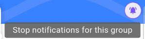
On top of those four events, every group also has its own bell icon on the group’s page, letting you turn notifications for that specific group on or off, similar to the Get notified button next to the Follow button, described in the Following section. Tapping it when notifications are on shows “Stop notifications for this group”, and it notifies you whenever a new post is published in that group.

The group bell: toggle notifications for that specific group on or off.

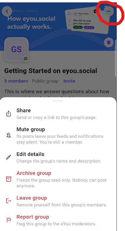
A group that has run its course can be archived by an admin: it becomes read-only, no new posts or members, and it drops out of search and browsing, but whatever was already visible to a given viewer stays visible to them.

A few things are explicitly not part of this first version, per eYou’s own documentation: a dedicated “your groups” lane in Discover with smarter recommendations, a moderator role sitting between member and admin, and group chat.

The platform's technical evolution and what changed across releases

If I put the novelty factor aside, what interests me most about eYou is the product trajectory. From the first version until now, the difference is not only about atmosphere. It is about operational clarity: how you enter the platform, how quickly you understand where you are, how fast you find the key actions, and what logic sits behind content distribution.

Release notes

Click each release title to expand the details.

Release 0: Prelaunch
  • Status: very early version, limited access / first-access stage.
  • First observed feed update: eYou started prioritizing posts in the user’s language. This was an early sign that the product was already trying to personalize content discovery from the beginning.
  • What I tested: account creation, profile setup, first interactions, and the basic logic of the feed.
  • Observation: the product direction was visible, but it still asked more intuition from the user than a mature platform would. Even so, language priority already showed a clear focus on relevance.
  • Product impact: even as a simple change, ordering posts by the user’s language matters a lot in an early-stage platform because it reduces noise and makes the feed easier to read from the first contact.
Release 1: The first usable version
  • Status: the platform begins to gain a more consistent logic of use.
  • What I tracked: profile, publishing, first discovery signals, and early reaction patterns.
  • Observation: the experience was becoming clearer, but onboarding could still have been more explicit for new users.
  • To be completed: release date and the concrete changes observed compared with prelaunch.
Release 2: UX and interaction iterations
  • Status: improvements aimed at smoother day-to-day use.
  • What I tracked: navigation clarity, publishing speed, and interaction feedback.
  • Observation: the product started reducing some of the early friction, but not evenly across all areas.
  • To be completed: what changed concretely in the interface and what impact it had in practice.
Release 3: Partial maturity of the core flows
  • Status: the platform becomes more coherent for repeated use.
  • What I tracked: consistency across profile, posting, discovery and networking.
  • Observation: this is the stage where it becomes easier to tell whether the product supports retention or only initial curiosity.
  • To be completed: date, which functions were stabilized, and which issues remained open.
Release v0.0.3
  • Platform snapshot: at this point, 6,459 accounts were mentioned, out of which 17 had been banned.
  • Published activity: the platform had 6,131 posts, with 185 of them moderated.
  • Conversation volume: 6,776 comments were reported, with 245 moderated.
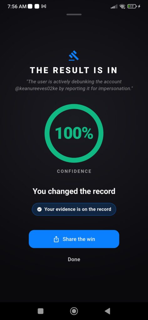
  • Rule enforcement: one of the cited bans involved an account impersonating Andrew Tate, suspended pending authenticity clarification. From a product perspective, this was an early sign that impersonation was already treated explicitly.
  • Product impact: v0.0.3 is valuable mostly as a stage snapshot. It does not only describe features. It shows that the product already had real usage volume and a concrete need for moderation, including impersonation cases.
Release v0.0.5
  • Smoother image viewer: image viewing improved through better pinch-to-zoom and stronger support for double-tap zoom.
  • Profile improvements: profile received pull-to-refresh, faster banner updates, and a cleaner layout.
  • More practical feed: the see more option expands posts inline without disrupting reading flow.
  • Better comment handling: reply state clears when closed, and the header sits more correctly under the notch or Dynamic Island.
  • Better reaction search: emoji search for reactions works across multiple languages.
  • Dark mode polish: onboarding and authentication screens were refined in dark mode.
  • Translation fixes: translation issues were corrected across five languages.
  • Product impact: v0.0.5 is a visible polish release. It does not reshape the product architecture, but it improves the exact interactions users feel immediately: images, profile, comments, feed, and localization.
Release v0.0.6 (April 28, 2026)
  • Smoother scrolling: this version improved day-to-day navigation feel across the feed and common interactions.
  • iOS post-opening fix: the issue affecting post opening on iPhone was corrected, improving consistency across platforms.
  • General refinements: the release also mentioned several additional improvements without full detail, which suggests a build aimed at stabilization and polish.
  • Product impact: v0.0.6 looks like a UX infrastructure release, less about new features and more about making the app smoother and more predictable in daily use.
Release v0.0.7+50
  • Comments crash fix: the app no longer closes when the comments panel is dismissed while the user switches screens.
  • Smoother scrolling, lower overhead: large images, tab animations, and @mentions run more efficiently, with a positive side effect on battery use.
  • Better Android navigation: the Android back gesture works more reliably with predictive back animation.
  • Content no longer hides behind Android navigation: lists, bottom sheets and toolbars remain properly visible instead of overlapping system UI.
  • External links on Android: links open more predictably, and if they cannot open, the user gets a clear message instead of silence.
  • More readable forms: text fields in Edit Profile, Comments and Report now have stronger contrast.
  • Cleaner comments input: the comment box has better visual separation, making the writing area easier to identify.
  • Smarter moderation: casual language, edgy humor, sarcasm, and friendly exchanges remain more visible, while the system focuses more on real harm such as bullying, harassment, and threats.
  • Product impact: v0.0.7+50 is clearly a stabilization build. The emphasis is on Android comfort, interface clarity, and moderation that is better calibrated for everyday conversation.
Release v0.0.8 (May 1, 2026)
  • Carries over the v0.0.7+50 stabilization work: the same pass continues here: comments crash fix, smoother scrolling with lower battery cost, more reliable Android back navigation, layout fixes so lists and toolbars no longer hide behind the navigation bar, more predictable external links, higher-contrast form fields, and a cleaner comment input.
  • Smarter moderation: colloquial language, edgy humor, sarcasm, and friendly back-and-forth are treated more loosely, while the system focuses more on real harm such as bullying, harassment, and threats. The result is that fewer normal posts are hidden by mistake.
  • Rule enforcement against fake accounts: several impersonation and identity-spoofing accounts were removed, which shows moderation is not only theoretical.
  • Product impact: v0.0.8 is a stabilization and calibration release. It improves concrete Android usage and also confidence that moderation distinguishes better between normal conversation and harmful behavior.
Release v0.0.9 (May 2, 2026)
  • Improved fact-checker: the fact-check mechanism was substantially revised. It is more cautious with contested or opinion-based claims, understands sarcasm better, explains more clearly what it can and cannot verify, and relies on more authoritative sources.
  • Clearer follow counts: follower and following lists now show the exact count directly under the title, giving clearer network context.
  • Better comment editing: users can add or modify @mentions when editing a comment.
  • Pulse tab update: the Pulse tab received a sticky tagline banner above the news feed, suggesting a clearer direction for that section’s identity.
  • Optimistic replies bug fix: replies published optimistically can now be edited without manual refresh.
  • Replies bug fix: a duplicate-key crash when loading more replies was fixed.
  • Faster mention rendering: @mentions now appear immediately on new comments without refresh.
  • Cleaner quote-post previews: quote-post previews hide while the mention suggestions list is open.
  • More stable mention suggestions: mention suggestions no longer overflow the layout when the keyboard is open.
  • Product impact: v0.0.9 is a trust and conversation refinement release. It improves both fact-checking logic and the small UX details inside comments that strongly shape quality perception.
Release v0.0.10 (May 4, 2026)
  • Refreshed legal acceptance flow: legal documents now use collapsible sections, making them easier to read during acceptance.
  • Marketing opt-in: marketing communication preferences can be managed both during sign-up and later from Settings.
  • Better reposts: users can edit their own reposts, forward @mentions when reposting, and see a placeholder if the original post was deleted.
  • Embedded reposts: an embedded repost can be opened directly from the post detail page, making navigation between conversations smoother.
  • Profile improvements: profile banners now use a more refined 2:1 crop, and header buttons have a more unified style.
  • Fact-check improvements: fact-check results include more interpretation details, not only the verdict itself.
  • Reader takeaway: each fact-checked post includes a short sentence summarizing what an average reader would likely believe after seeing the content. This is interesting because it shifts some attention to perceived effect, not only author intent.
  • Smoother onboarding: the onboarding flow was stabilized and refined through several corrections that reduce early friction.
  • Product impact: v0.0.10 looks like a foundational release focused on clarifying rules, consent, reposting, and early trust mechanisms in the platform.
Release v0.1.0 (May 7, 2026)
  • Translation overhaul: comments can now be translated directly, and users can choose whether they want to see original content by default. This is an important step for readability in a multilingual platform.
  • Better language setup in onboarding: preferred translation language becomes part of the initial setup, and the list of supported languages expands to 184. This signals a clear orientation toward accessibility and international scaling.
  • Post preview settings: users can choose how much content they see before see more, between Compact (3 lines), Standard (5), and Expanded (12). It is a small setting, but relevant to how you consume the feed.
  • Better organized Settings: display and language options are grouped in a cleaner section, and the language and theme pickers were redesigned.
  • Legal documents viewer: legal documents can be reviewed directly from Settings, including switching between document versions.
  • Pulse banner improvements: the Pulse tagline now scrolls smoothly when the text is too long for the screen width.
  • Feed stability fix: the feed no longer reloads or clears unexpectedly after returning from links, share sheets, image pickers, or permission dialogs.
  • Product impact: v0.1.0 is an important release for the experience foundation. It does not only add visible features. It also organizes setup, translation, and day-to-day navigation stability.
Release v0.2.0 (May 12, 2026)
  • Two feeds in Discovery: users can switch between For You and Latest, and the choice is remembered across devices. From a product perspective, this is one of the releases that clarifies content consumption logic the most.
  • Browse posts by category: tapping a category chip opens all posts tied to that topic. Categories mentioned in this release include Politics, Travel & Outdoors, Arts & Culture, Tech & Science, Society & Ideas, Relationships & Family, Food, Business, Lifestyle & Wellbeing, Sports, and Pets.
  • Following becomes strictly chronological: posts from followed people appear newest first, without algorithmic reordering. This matters for users who want control and predictability.
  • No repeated posts on refresh: on pull-to-refresh in Discovery, the system skips the last 500 posts already seen, which reduces the feeling of a redundant feed.
  • The feed does not dead-end: when you catch up with recent posts, Discovery keeps reaching further back, and the user can also reset the experience and explore again.
  • Comment notifications land in the right place: when you tap a reply notification, the app takes you exactly to the right comment together with the surrounding conversation.
  • Visual signaling for reactions: the agree thumb becomes green while disagree remains blue, a small but clear change in reaction readability.
  • More reliable fact-checks: checks now complete more consistently, even on longer or more nuanced posts.
  • Artistic content handled more intelligently: artistic nudity in painting, sculpture, or art photography is no longer treated the same way as explicit material, which suggests more refined moderation.
  • Pets and Animals separated: pet content is separated from wildlife, which helps both classification and discovery.
  • Light anti-spam limits: up to 1 post every 30 seconds, 20 per hour, and 100 per day. The limits are loose enough for normal use, but still useful against abuse.
  • Product impact: v0.2.0 is a major release for feed architecture. This is where it becomes clearer that eYou is trying to offer transparency in content consumption rather than simply imitate classic social network behavior.
Release v0.2.1 (May 14, 2026)
  • More interface languages: the app adds support for Italian and Spanish, an important step for user-base expansion and clearer onboarding in new markets.
  • 12 new categories for Discovery: categories added include Humor, Entertainment, Daily Life, Photography, Wildlife, Tech & Gaming, Anime, Arts, Literature, Design, Science, and Religion. In practice, this means a clearer taxonomy for exploration and publishing.
  • Character counter in the composer: users now see in real time how much space is left in the editor, and the posting limit is communicated clearly at 3,000 characters. It is a small improvement, but very useful because it removes surprise rejections at publish time.
  • Dark mode polish: notifications, post cards, the article back arrow, carousel indicators, and unread rows were adjusted so the interface feels more visually consistent.
  • Smoother comments: the keyboard can be dismissed by tapping on the comments list, and the reply box clears automatically when switching to reply to another comment.
  • Better flag emoji search: you can search by country name or ISO code, and flags for England, Scotland, and Wales are now included.
  • Better bottom sheet positioning: bottom sheets respect the system navigation bar more consistently, without awkward overlap.
  • Layout and performance improvements: the release gathers many small adjustments that together make the app feel more stable and better finished.
  • Product impact: v0.2.1 looks like a UX infrastructure release. It does not only introduce new elements. It makes the existing experience more predictable, more internationalized, and easier to use in practice.
Release v0.3.1
  • Rewards and badges: users can earn rewards through participation on eYou, including badges such as Early Believer, review them in the Rewards tab, claim them, and choose one to display next to their name.
  • Sharing for posts and profiles: each post now has a Share button, and your own profile gets direct Share and Edit actions below the follower count. Links such as eyou.social/u/handle and /p/post open directly in the app.
  • Profile polish: the own-profile menu was simplified in favor of more direct actions, reducing navigation friction.
  • Localized country picker: the country list appears in the user’s language, with accent-aware search. A useful example is that typing tara can still find Tara. According to the release, coverage expanded to about 250 territories.
  • Cleaner comment replies: tapping Reply no longer auto-inserts @username, because the reply is already correctly attached inside the thread.
  • Product impact: this release feels focused on UX clarity, better content distribution, and the small details that make the platform more coherent in daily use.
Release v0.3.5 (May 25, 2026)
  • Android stability and performance: cold starts no longer hang on the splash screen, sign-in is faster, and apparently random sign-outs were removed. Network calls also fail faster when something is wrong, instead of hanging too long.
  • Smoother sign-in on all platforms: small authentication issues no longer break the flow through unnecessary popups, onboarding is no longer replayed for users who are already configured, and sign-in error messages are translated across all 7 supported languages.
  • Better link handling: eyou.social links opened from inside the app no longer ask “Leave app?”, but open directly. In addition, an eyou.social/open link opened from an Android browser can launch the app directly.
  • Cleaner photo composer: when posting multiple images, each preview shows its position in sequence, making visual composition clearer.
  • GIFs stay animated: uploaded GIFs keep their animation, and upload error messages are now fully translated.
  • iOS notifications fix: tapping a notification no longer opens the same page twice.
  • News articles from quote reposts: like, share, and comment actions now work even when the article is opened from a quoted post.
  • Early Believer badge redesign: the badge got a new visual identity with a fleur-de-lys icon.
  • Product impact: v0.3.5 looks like an important consolidation release because it repairs exactly the kind of small but frequent issues that strongly affect a user’s sense of stability.
Product update: referral program and personalized Discovery
  • Launch status: the update was already available on iOS, while Android was still under approval.
  • Referral program live: users can access the new invite button in the top bar, open their referral page, copy the link, and share it through DMs, WhatsApp, Instagram, or a bio. Each confirmed invite contributes to a ladder of 4 permanent badges: The Sharer, The Convincer, The Charmer, and The Influencer.
  • Referral progress card: the referral page clearly shows how many more invites are needed for the next badge, making the system easier to track and more motivating.
  • More personal Discovery: through the tune icon in Discovery, users can choose the topics they care about, and that selection affects both the For You and Latest feeds as well as the order of category chips.
  • New badge rarity colors: each badge tier gets its own gem-inspired palette: gold, emerald, ruby, and amethyst.
  • Displayed badge remains visible: the selected badge now stays visible in the profile header even while scrolling.
  • Referral and reward notifications: users get notified when someone joins through their link and when a reward is received, with direct access to the relevant item.
  • Properly translated fact-check topic chips: thematic chips in the fact-check area now display correctly across supported languages.
  • Discovery preference fixes: For You / Latest sorting and category filtering both work correctly after preferences are saved.
  • Product impact: this is one of the updates that moves eYou from simple usage toward clearer growth and personalization systems. Referral introduces a visible reward logic, while Discovery becomes more configurable and closer to the user’s actual interests.
Release v0.4.0 (June 9, 2026)
  • Polls directly inside posts: you can create a poll right from the post composer with 2, 3, or 4 options and watch results come in live as the community votes.
  • Flexible voting and the Abstain option: users can vote, change their choice before the poll closes, and choose Abstain if none of the offered options fits. From a product perspective, this is interesting because it explicitly introduces the right to participate without endorsing one of the listed answers.
  • Translation for poll questions and options: the poll text and response options can be translated in one tap, which is very useful in a multilingual network.
  • Comments reimagined: the comment box was rebuilt and feels cleaner and smarter to use.
  • Emoji in comments: besides agree and disagree, users can now add emotional reactions directly inside comments through emoji, which separates opinion from affective response more clearly.
  • Images in comments: comments can now include a picture, with a camera button integrated directly into the composer.
  • Live counter and larger comment limit: the comment box shows a real-time character counter, and the limit rises from 600 to 1,000 characters.
  • New network tab: Referees: a new tab shows the people who joined eYou through you and the total count associated with your referrals.
  • Smarter Topics: the Topics screen remembers your last choice between For You and Latest and opens in that same state next time.
  • Easier reaction removal: if you tap your active reaction again, it is removed. It is a small detail, but very good for interaction control.
  • Notifications for poll interactions: when someone interacts with your poll, you get a notification and land in exactly the right place when you tap it.
  • General polish: sharing a post now produces a clean link, and the app stays locked to portrait orientation for a more stable experience.
  • Product impact: v0.4.0 is a major release because it adds a new conversation format through polls, meaningfully expands comments, and strengthens referral and topics. It is one of the versions where the shift from basic polish to more mature social features becomes very clear.
Release v0.5.0
  • Draft posts: unfinished posts can now be kept as drafts, which changes the composer flow because users no longer have to rebuild a post from scratch if they leave before publishing.
  • Reaction model cleanup: the older like/dislike pattern is better represented as Agree and Disagree, separating opinion signals from the more expressive emoji layer.
  • Post interaction flow: post-level actions were refined so reactions, emojis, comments, and sharing are easier to understand as separate interaction types.
  • Product impact: v0.5.0 improves the publishing workflow and makes post interactions easier to read, especially for users who create longer posts or return to unfinished content later.
Release v0.5.1 (June 16, 2026)
  • Sign in with Bluesky: users can now sign in with Bluesky, which brings over their name, bio, and pictures.
  • Redesigned sign-in screen: the sign-in experience has been cleaned up and now includes a light/dark toggle.
  • New fact-check design: fact-checks now show confidence scores and clearer accuracy labels.
  • Live polls refresh automatically: poll results now update automatically, and a manual refresh button has also been added.
  • Reorganized post buttons: the post action row has been reorganized, with Share now included directly in the action row.
  • Replies can now be flagged: users can now report replies to comments.
  • Full-screen support on iPad: the app now supports full-screen mode on iPad.
  • Bug fixes and polish: this release also includes general fixes and interface refinements.
  • Product impact: v0.5.1 improves sign-in flexibility, fact-check clarity, poll usability, moderation coverage, and general interface polish.
Release v0.6.1 (June 30, 2026)
  • Videos in your feed: videos now play inline right where they appear in the feed, without detours or extra taps.
  • Dedicated Videos tab: a full-screen, reels-style tab for scrolling through video content on its own.
  • Smart autoplay on scroll: autoplay can be set to Always, Wi-Fi only, or Never, so the user controls data use.
  • True orientation: portrait stays portrait and landscape stays landscape, with no more squished or letterboxed video.
  • Community disputes for fact-checks: users can challenge a fact-check and let the community weigh in, and unverifiable claims are now marked clearly instead of receiving a misleading score.
  • Rich link previews: a shared link now renders as a proper preview card instead of a bare URL.
  • eyou.social links open in-app: tapping an eyou.social link from anywhere lands the user directly inside the app, with no extra steps.
  • Account passwords from Settings: users can set or change their password without leaving the app.
  • Smoother sign-out: sign-out now shows a clear progress screen so the user knows exactly what is happening.
  • Polish: action bars were redesigned to be consistent across all feeds, Shared Feeds settings gained a default-tab switch, and numerous video playback, layout, and stability issues were fixed.
  • Product impact: v0.6.1 is a major release because it brings native video into the platform, both inline and as a dedicated tab, while strengthening fact-check transparency, link handling, and account control.
Release v0.6.2 (July 7, 2026)
  • Better comment threads: replies now open in a dedicated thread panel, so conversations are easier to follow, reply references are clearer, and a notification can take you directly to the relevant reply.
  • Clearer reactions and social proof: reactions now appear above the action bar, with named summaries such as “Marie and 4 others,” making it easier to see who engaged with a post.
  • Reactions more visible across the app: reaction emojis are now shown on comments and on news article cards, giving more context at a glance.
  • Better fullscreen video: the Videos tab now supports a vertical swipe feed in fullscreen, with reworked playback controls for smoother viewing.
  • Faster navigation: re-tapping Home or tapping the header scrolls you back to the top.
  • “Proven right” credit: when your dispute changes a verdict, you now receive a credit for correcting the information.
  • More languages, better translations: Polish and European Portuguese were added, bringing the total to 9 languages, alongside a full translation quality pass across all locales.
  • More natural comment order: comments now read from oldest to newest, making discussions easier to follow.
  • Fixes and improvements: smoother feed scrolling with link previews no longer causing layout jumps; comment sheets no longer stack or misroute replies; the blocked-users list loads all pages and handles errors; video drafts survive between sessions; unavailable quoted posts show a neutral placeholder; and the feed tab bar is centered again.
  • Product impact: v0.6.2 is a refinement release focused on conversation clarity, reaction visibility, smoother video, and reliability across feeds, comments, and notifications.
Release v0.6.4 (July 10, 2026)
  • The Bell (a direct line to the voices you trust): a bell next to the Follow button lets you get notified the moment someone you trust publishes, taking you straight to their post with no algorithm or feed ranking in between.
  • Immersive Mode: tap a photo, video, text post, or the fullscreen icon to enter a distraction-free view and swipe up between posts. Photos open in a fullscreen gallery with zoom and multi-image browsing, videos play edge to edge, and text posts get a dedicated reading experience: short posts as visual posters, longer posts with clearer typography and comfortable spacing.
  • The Pulse redesigned, the Briefing: verified AFP and Reuters news becomes a magazine-style experience. Browse stories as fullscreen covers, swipe down for the next one, or swipe left to open the full article in a clean reading view, with a progress line and the next story ready at the end. Fact-check verdicts and community reviews stay visible throughout.
  • Product impact: v0.6.4 adds three new ways to experience eYou: staying closer to trusted voices, exploring content without distractions, and reading verified news in a more intuitive format.
Release v0.7.0 (July 13, 2026)
  • Multiple accounts, one tap away: you can now add up to 4 eYou accounts and switch between them instantly, with no need to log out and back in.
  • Stronger account security: two-factor authentication is now available, letting you protect your account with an authenticator app through a simple step-by-step setup.
  • Clearer app messages: if the app is temporarily rate-limited, you now see clearer messages explaining what is happening, so you always know what to expect.
  • Product impact: v0.7.0 makes multi-account use practical, adds a real security layer through 2FA, and improves everyday clarity through better feedback messages.
Release v0.8.0 (July 24, 2026)
  • Better conversations: replying to a comment now opens its full thread, and post owners can remove any comment on their own posts.
  • New Activity tab: see all your reposts and comments in one place on your profile.
  • Smoother translations: a cleaner See translation bar now sits right above translated posts and comments, shows which language the content was translated from, and lets you adjust your translation settings on the spot.
  • Little things that feel good: pick your language right on the sign-in screen, autofill your two-factor code from your password manager, tap a tab twice to jump back to the top, and enjoy faster photo cropping.
  • Product impact: v0.8.0 is a conversation and polish release: clearer threads, real comment moderation for post owners, a dedicated Activity view, and a string of small frictions removed from onboarding, 2FA, navigation, and image cropping.
Release v0.9.0 (August 1, 2026)
  • Share to eYou: you can now share text, links, photos, and videos from other apps straight into eYou to start a new post (Android & iOS).
  • New accent color picker: choose from six accent colors to personalize the app.
  • New text size setting: a 5-step slider lets you adjust text size to your comfort.
  • Settings reorganized: Settings has been rebuilt into a cleaner hub with dedicated category screens, instead of one long flat list.
  • Fullscreen images now rotate with your device’s physical orientation.
  • Moderation-cleared notifications: you now get a notification when your post or comment has been cleared by moderation, not only when it is flagged.
  • Fixed: tapping a link cut off by see more truncation now opens the full URL.
  • Fixed: the report sheet no longer covers the full screen, keeps the details field visible, and has a clearer submit button.
  • Product impact: v0.9.0 mixes a genuinely useful new entry point (sharing into eYou from other apps) with personalization (accent color, text size), the promised Settings reorganization, and a round of smaller fixes to images, moderation feedback, links, and reporting.
Release v0.10.2 (August 24, 2026)
  • Streaks are here: stay active every day to build a streak, protected by freezes when life gets in the way. Take on quest week for bonus rewards, and collect badges as your streak grows. A flame timeline shows the whole journey, including the days a freeze saved you, and you can share your streak with friends right from the app.
  • Edit your posts anytime: the 15-minute edit window is gone. You can now edit a post whenever you want, with a small “edited” marker keeping things transparent.
  • Better comments: new comments load automatically as you scroll, no more tapping to see the next page; and post authors can now hide comments on their own posts instead of deleting them, showing a placeholder, and anyone can tap to reveal them.
  • Mentions that actually reach you: tagging someone in a comment now reliably notifies them everywhere, including on your own posts.
  • Full-screen photos and videos: rotate your phone to view media full-screen, respecting your rotation lock if it is on.
  • Smoother sign-in: two-factor prompts now show which account they are for, and you can switch accounts without starting over; clearer error messages and a proper retry screen if sign-in stalls.
  • Fixes and safety: edited video posts can be reposted again; stronger protection against spam and scam posts; and the World Cup and Tour de France topics have wrapped up and are now part of Sports.
  • Product impact: v0.10.2 is a major release: it adds a whole new engagement mechanic in Streaks, removes the long-standing post-edit time limit, resolves the comment-deletion debate in favor of hiding, and fixes a real gap in mention reliability, alongside sign-in and safety polish.
Release v0.11.4+87 (September 6, 2026)
  • Groups have arrived: public, private, and secret communities built around a shared interest, city, team, or cause. See the dedicated Groups section for how they work and how to create and administrate one.
  • App-only at launch: Groups did not reach the web app in this release; that came shortly after (see the web guide).
  • Navigation shift: Groups took over the bottom-nav slot that used to be the Friends list; your Followers, Following, and Referrals moved to the Profile tab instead.
  • Unified search: one search now finds people and Groups together, instead of people only.
  • Notifications rebuilt: similar notifications are grouped together, entries are sectioned into Today, Yesterday, and older in your own local time, and filters now sit at the top.
  • Rewards case previews locked badges: the Rewards case now shows badges you have not unlocked yet, not only the ones you already have.
  • Pin a post: you can now pin one post to the top of your own profile, and group admins can pin one post to the top of their group.
  • Mute: a lighter alternative to blocking, for accounts you follow. A muted profile’s posts leave your feed silently, with nothing taken from their side and no notification sent to them.
  • Performance: a faster app launch, faster image loading, and clearer error messages.
  • Product impact: v0.11.4 is a major release built around Groups, but it also reshuffles core navigation (Groups replacing the Friends list, Network moving to Profile), broadens search, redesigns notifications, and adds smaller but genuinely useful touches like profile pinning and muting. (Source: eYou’s official announcement post.)
Release v0.11.5 (September 14, 2026)
  • YouTube, now inside eYou: YouTube videos play directly inside the feed. Tap the preview and watch without leaving the app.
  • Smarter links: eYou links opened from the web now take you straight to the right post, profile, or group inside the app.
  • Group avatar crop: group profile pictures now use the same rounded-square crop you see across the rest of the app.
  • Correct timestamps: new and edited posts now show the correct time immediately.
  • Fixes: an Android error caused by tapping the camera or gallery button twice is fixed; an Android issue when rotating the phone while swiping through fullscreen photos is fixed; and notifications are now grouped by day more consistently.
  • Product impact: v0.11.5 is a smaller, cleanup-style release: YouTube embeds close a long-standing gap, web-to-app links finally land where you’d expect, and a handful of rough Android edges get smoothed out.
Release v0.11.8+89 (beginning of October 2026)
  • Easier to watch YouTube videos: tap a YouTube video to watch it, turn your phone to watch it in landscape, and swipe it away when you are done.
  • The action bar everywhere you need it: posts, comments and news articles now share the same action bar, and you can see who reacted just above it. On posts and comments the Share button is built in; on news articles it is grayed out and inactive in the app (hidden on the web), so only Repost works there.
  • Hold React on a comment: hold the React button on a comment and slide to choose a reaction, just like on a post.
  • Titles you can read: your full title now shows under your name without being cut off mid-word.
  • A faster feed: swiping between videos is smoother while the feed loads ahead of you.
  • Product impact: this release is about how the app feels in daily use: watching, reacting and reading are smoother, and the same action bar now appears on posts, comments and news articles.

Current release

Release v0.11.9+92 (current) (October 14, 2026)
  • Repost from more places: you can now repost straight from a post’s action bar and from the immersive feed.
  • Video uploads: the screen stays awake while your video uploads, and a failed upload is retried when you return.
  • Streak card sharing: sharing your streak card works again.
  • Photo picker: a double tap no longer opens the photo picker twice.
  • Notification prompt: the notification prompt is asked once and closes cleanly.
  • Stability: fewer crashes when leaving a screen with a menu open.
  • Narrow screens: post actions stay on one row on narrow screens.
  • Product impact: v0.11.9 is a reliability release with one addition: Repost now sits in the action bar and the immersive feed, and the rest tightens up uploads, sharing, notification prompts and crashes.

Bugs

Because I have followed the platform from the beginning, it feels more useful to end the article with an honest evaluation of the areas that still seem transitional. This is not only about classic bugs, but also about flows that still do not feel fully matured.

Bugs and limitations

  • fact-checking does not handle real-time events reliably yet (if no reputable source is found) and can label still-developing situations as false before enough verified context exists; However this is now easily solved through the challenge system – read all about it here
  • when Text size (Settings → Display & appearance) is set to its maximum, the emoji bar in the comment composer gets cut off, so at that text size some emoji options may not be fully visible or reachable

Suggestions

Popular requests and Features that still seem in progress

One of the most requested features landed already:

A web app has been launched (Alpha). The single most asked-for addition has arrived: eYou is no longer mobile-only, and you can now use it from a browser at eyou.social. It is still an early Alpha with plenty of rough edges, and the dedicated eYou web app guide covers what it does and where it still falls short.

Groups have shipped too. Communities built around a shared interest, city, team, or cause are now part of eYou: see the dedicated Groups section above for how they work.

Beyond that, a few requests have stood out for a long time:

  • Private messaging: direct, one-on-one conversations, so people can talk without it being visible to the rest of the platform.
  • Hashtags: tagging and discovering posts by topic.

Beyond those, a few more areas still feel transitional:

  • Content discovery through Search, not only through Discovering and topics; Users would like to be able to serach for keywords and hashtags when they become available, both in posts and in groups.
  • Users cannot quote / repost their own posts;
  • The ability to disable comments entirely on a post, leaving only reactions active (a request raised directly with @eYou by a user who said reactions, even negative ones, bother them far less than open comments do);
  • A dedicated Trends view, surfacing what is gaining traction across the platform;
  • A way to connect your Contacts and see which of them are already on eYou, rather than having to search for people one by one;
  • In-app notification controls, since there is currently no way to manage notifications from the app settings (for now, the only workaround is disabling them for eYou from the phone’s system settings);
  • Further creator tools, like dashboards, metrics and whatnot – very unlikely to happen through;
  • An even clearer experience around distribution, so users understand better what happens to a post after publishing and moderation.
  • A way to turn off Streaks: an opt-out for users who would rather not have the day-count gamification layer at all.
  • A way to Set the Entry Tab: Whether is either the Feed, one of the Categories or maybe Pulse / Video tabs.
  • Tagging Groups: Use the @ to tag a Public / Private group similar to how we tag profiles.
  • Reposting to Groups: Use the Repost button to select a Group, similar to how we repost on our own profile.
  • Markdown links and richer formatting: Users would like to insert text links, for example a clickable word instead of a long address, and to use more Markdown in both the post and the comment editors, not only bold and italic.
  • A Disconnect button for Bluesky: a way to unlink a connected Bluesky account from Settings, under Connected accounts.
  • Events: according to an official response from the team, an Events feature is already on the development backlog, but there is no confirmed release timeline yet. A general calendar with appointments is not currently planned; the team said it can be added to its list of suggestions.
  • Link previews with a hide-address option: Users would like a pasted link to be parsed so that the page title is shown, and to be able to remove the address from the post before publishing, or to have the address hidden by default, with a button to show or hide it.
  • Sharing Pulse articles externally: a way to share a Pulse article outside eYou; for now the Share button on news articles is inactive in the app.
Community debate: should authors be able to delete comments? (Resolved: hiding won)

Since v0.8.0 added the ability for post owners to delete any comment left on their own posts, it turned into one of the more actively debated features on the platform. Rather than settling it quietly, @jasseem opened it up as a live community vote, laying out three options:

  1. keep the current deletion capability as-is;
  2. remove it entirely, leaving comment removal to platform moderation only;
  3. replace it with a hide function, where a comment stays in the record but collapses from view instead of being deleted outright.

In a follow-up post, Jasseem laid out the case for each side ahead of the vote, citing external and platform-level data (summarized here as presented, not independently verified):

  • For deletion: unmanaged hostility drives people to stop posting rather than just feel bad about it, citing UNESCO/ICFJ survey data on online abuse of women journalists (73% had faced attacks, 45% now self-censor); also notes that Facebook, Instagram, and YouTube already give authors this option.
  • For hiding: pointing to X’s similar “hide replies” feature, whose own data reportedly showed most hidden replies were disagreement or off-topic content rather than actual abuse, and that a share of people whose replies were hidden said they would reconsider how they engage afterward, a visible consequence unlike a silent deletion.
  • What neither option solves: hiding does not spare the author from reading the comment first, and deletion does not stop someone determined to keep posting again.

The framing Jasseem settled on: deletion puts the cost on the commenter, removed without appeal, while hiding puts it on the author, left with a visible mark that something was pushed aside.

Round one closed with 355 votes and no majority: Keep it led with 44%, Replace with hiding got 28%, Moderation only got 23%, and 5% abstained. Moderation only came in third and was eliminated, leaving a straight Keep it vs. Replace with hiding runoff for round two.

Round two, the final decision: 228 votes were cast. Replace deletion with hiding won with 122 votes (54% of all votes, 57% of expressed votes), against 91 votes (40%) to keep deletion and 15 abstentions (7%). Hiding won by a clear margin, and Jasseem’s own framing of the result was that eYou chose “the option that leaves a visible mark over the one that erases silently.”

What actually shipped, in v0.10.2: post owners can now collapse a comment on their own post rather than delete it. Readers can still expand and view a hidden comment; nothing is erased. The old deletion feature was retired once hiding launched, though comments deleted earlier, under the old rules, stay deleted; hiding is not retroactive. See the Comments, replies and reporting section above for how hiding actually works day to day.

You can read all four posts directly: the original vote, the evidence follow-up, the round-two ballot, and the final results.

In short, I see eYou as a promising product that is still visibly under construction. That is exactly why it remains interesting to watch: not because it is finished, but because you can still see it taking shape.

Terms and Conditions

The platform’s legal documents are available directly inside the app. From Settings, you can open the legal documents viewer, read the Terms and Conditions and related policies, and switch between document versions. The same documents are also presented during the acceptance flow when you first sign up, now organized in collapsible sections so they are easier to read.

Support

If you run into a problem or need help, the contact support option is available at the bottom of Settings, alongside account management actions such as blocked users, logout, and account deletion. This is the most direct way to reach the team about an account or technical issue from inside the app, as well as any feedback and ideas you might have.

Contact support

About the author

Brîndușa Maria, Senior Software Test Analyst, ISTQB® Certified Tester Advanced Level Test Analyst (CTAL-TA). I write about how to recognize online scams. LinkedIn

Note: this article is based on my research and professional experience. I used artificial intelligence tools for drafting and editing.

📢 Share the knowledge, stay safe! 🔒✨ Use the share buttons below and help others stay safe online. The more we know about online scams, the better protected we are! 🚀💙

2 Responses

  1. Mulțumesc pentru tutorialul publicat, ce nu am reținut din el:
    – adresele e-mail ale celor 2 cofondatori unde pot trimite opinii personale

Leave a Reply