
The eYou web app
For most of its life eYou was mobile-only, and a web version was the single most requested addition from the community. eYou's web app launched at eyou.social on July 15, 2026, and has evolved steadily since: a major layout overhaul on July 23, a personalization update on August 1st, and Groups arriving alongside the rest of v0.11.4 (see the release history below for the full timeline). The web app now sits at essentially the same feature level as mobile.
This short companion guide covers what the web app is, how it maps to the mobile app documented in the main eYou guide, and, below, focuses specifically on where the two still differ.
You sign in with the same account you use on the app (there is no separate web account), so your profile, posts, followers and other account-level data are all there. Note, though, that device-based settings do not carry over: things stored per device, such as the list of additional accounts in the account switcher and various local preferences, start fresh on the web and have to be set up again there.
About me
If this guide was useful and you want to follow along as the platform keeps evolving, you can find me on eYou as @safewiz. My public profile lives at eyou.social/u/safewiz; open it from a browser or the app to see what I post and to follow.
If you are not on eYou yet and want to join, you can use my referral link at www.eyou.social/r/safewiz. That way your account starts connected to my network, and it also counts toward the referral badges described earlier.
Now that Groups are live, I have also started one for this exact kind of ongoing discussion: Getting Started on eyou.social.
The main guide is also available in German: safewiz.eu/deguide. The German version was translated with AI assistance and then reviewed by hand; if you spot anything unclear or mistranslated, let me know.
Getting in
Open eyou.social in a browser and choose Sign in (or Sign up to create a new account). The web app offers three ways to authenticate:
- Continue with Apple;
- Continue with Google;
- Continue with Bluesky: the same Bluesky sign-in as the app, which can bring across your name, bio, and pictures;
- Continue with email: email address and password.
On first visit you will also see a cookie banner; you can decline the non-essential analytics and advertising cookies and still use the app normally.
The layout
On desktop, the web version uses a three-column layout instead of the mobile bottom bar:
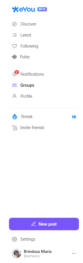
- Left rail: a persistent navigation column, grouped into three clusters. First, the feeds: Discover, Latest, Following and Pulse. Then Notifications, Groups, and Profile: as of v0.11.4 there is no separate Network item anymore, your Followers, Following and Referrals live under Profile instead, matching the mobile app. Below that, Streak (showing your current day count) and Invite friends. The New post button and Settings with your account sit at the very bottom. (Search now lives in the right rail rather than here.) Clicking the feed you are already viewing scrolls you back to the top, the same way re-tapping Home does on the app.
- Center column: the feed itself.
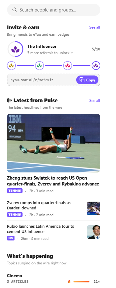
- Right rail: a column of discovery and utility widgets: a people and groups search box, an Invite & earn panel showing your referral badge progress and your referral link (with Copy), a Latest from Pulse list of wire headlines, and a What’s happening widget of topics surging on the wire right now, each with a “heat” multiplier. Below the widgets sits the footer with Legal and Support links and a “© 2026 eYou.Social — Made in Europe” line.

What works the same as the app
Most of the experience is a faithful port of the mobile app:
- Feeds: Discover (with For You / Latest and the topic chips), Following, Pulse, and Videos.
- Post actions: Agree, Disagree, Comment, emoji reactions, Repost, Fact-check, and Share, with the same confidence score on checked posts. Repost works the same way as on the app: a small menu lets you choose between an instant Repost or Repost with your thoughts (a quote-repost with your own commentary attached).
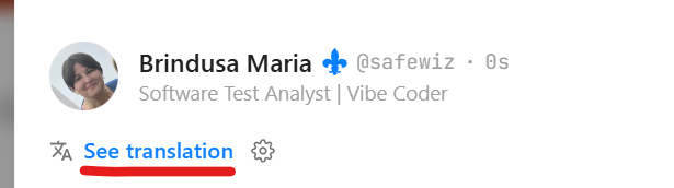
- Comments: the Comment button opens the thread, with an emoji picker and an image button in the composer, a 1,000-character limit (same as the app), and See translation on replies.
- The post owner can now delete Comments: left under their post.
- The Translation settings can be accessed in the post and comments now using the didcated cog, allowing users to switch between languages on the go;
- Profile: the same header, badge, bio, the Followers / Following counts and the “X people get notified when you post” bell line. As of v0.11.4, you can also pin a post to the top of your own profile, same as on the app.
- Get notified & Mute: a Get notified button next to Following lets you get a notification the moment a trusted account publishes; Mute (for accounts you follow) removes their posts from your feed quietly, without notifying them.
- Notifications: the redesigned notifications list matches the app: similar notifications grouped together, entries sectioned into Today, Yesterday, and older, and filter tabs (All, Mentions, Activity, Follows, Groups, System) at the top.
- Network and referrals: your Followers, Following and Referrals all live together under Profile, matching the app; see below for how that changed.
- Search: the app itself now finds people and Groups together in one search; whether the web's right-rail search box has caught up to that is [still unconfirmed].
- Settings: including two-factor authentication, Switch account, translation language, the “Always show original content?” toggle, Blocked users, and the Bluesky connection. Two newer personalization options are also here on the web: an Accent color picker (six colors for buttons, links, and highlights) and a Text size slider, matching what was added to the mobile app.
- Composer: text with image, video, and poll attachments, plus an emoji picker.
- Groups: public, private, and secret communities work the same way as on the app, reached from their own Groups item in the left rail. See the dedicated Groups section of the main guide for the full mechanics (types, roles, hiding posts, safety limits). [Screenshots and any web-specific layout differences still pending: I have not yet explored the feature on the web myself.]
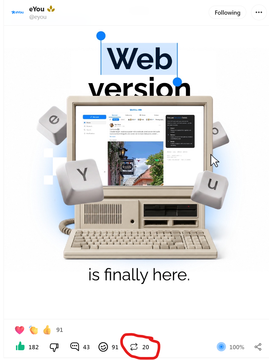
Network menu changes
Tapping Followers or Following on your profile opens the same combined view, which groups three lists together: Followers, Following, and Referrals (the people who joined through you). As of v0.11.4, this is where that view lives: there is no separate Network item in the left rail anymore, it moved here after Groups took over its old spot.

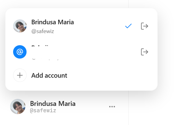
The account switcher popup has a nice addition: next to each account in the list (and the Add account option) there is now a dedicated log-out icon, so you can sign a specific account out directly from the switcher instead of going into Settings first.
One small but genuinely handy touch carried over from the app: the Share icon on a post works as a copy-link action: clicking it copies the post's link straight to your clipboard, ready to paste anywhere.

What is different on the web
A few things are adapted for the desktop, so it is worth knowing where the web and the app diverge:
- The three-column desktop layout with a persistent left rail, instead of the mobile bottom navigation;
- Pulse is a scrollable list of news cards rather than the fullscreen, swipe-through Briefing;
- Videos is a filterable feed (For You / Latest plus topics) rather than the fullscreen vertical-swipe experience;
- Post and Comments got a new layout, based on theor content. Clicking a post (or its Comment button) that doesn't have a picture now opens a reply modal in the center of the screen.
Clicking a post (or its Comment button) that doesn't have a picture now opens dedicated side panel: the post sits at the top with a reaction social-proof summary above the action bar (for example “You and 25 others”), then the full action row with counts, the thread, and the composer. This fixes the back issue (tapping back would return the user to the top of the feed)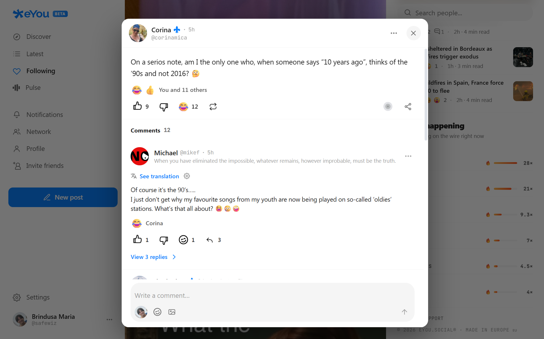
The new comment layout in the eYou web app: a middle panel with the post, reaction summary, action bar and comment composer The character counter is also presented differently: a small live counter badge (for example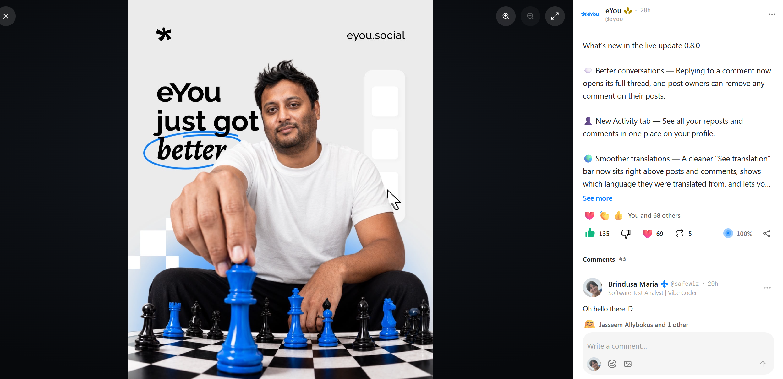
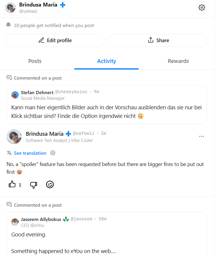
The new comment layout: a side panel with a reaction social-proof summary above the action bar, the thread, and a composer. 92/1000) pops up next to the send button as you type, instead of the app's in-composer counter. - Profile tabs are different. On the web they are Posts, Activity (a feed of your recent activity, such as comments you have made) and Rewards, and there is no Quests tab anymore. As of v0.11.4, the Rewards case here also previews badges you have not unlocked yet, matching the app.
- The web adds a persistent right-hand discovery rail with no direct mobile equivalent: people search, an Invite & earn referral panel, Latest from Pulse headlines, and a What’s happening list of topics surging on the wire (with a “heat” multiplier).
- Streaks get their own left-rail entry. On the app, you reach the Streaks page via the flame icon on your profile or Home page (see the Streaks section of the main guide for how the feature itself works); on the web it is instead a dedicated Streaks item in the left rail. The artwork is also different from the mobile version. [Screenshots pending: web-specific images needed here, the mobile ones do not apply.]
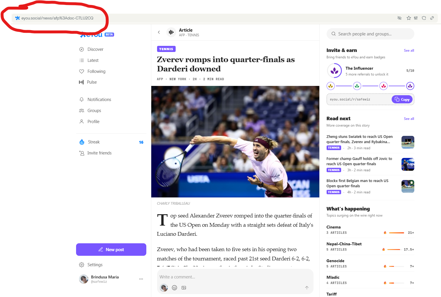
- Sharing a news article works differently. In the app you can only repost a Pulse news item; on the web, each article opens at its own browser URL (for example
eyou.social/news/afp:doc-…), so you can simply copy the link from the address bar to share the article directly: there is no separate Share button on a news article because the URL already does the job. - Setting the Group Banner and Avatar images menu is different.


Put simply, if you already know the app, the web version will feel immediately familiar; it mostly rearranges the same pieces for a larger screen, with a few of the more immersive mobile interactions left out for now.
Web app release history
- July 15, 2026: Launch (Alpha). eYou's web version goes live at eyou.social, the platform's first browser-based access after being mobile-only.
- July 23, 2026: Major overhaul. The layout and several flows were substantially reworked: the three-column layout with its left, center, and right rails, the new comment side panel, and updates to Network, Repost, and Activity, alongside most of the fixes noted below.
- August 1st: personalization update. A new Accent color picker (six colors) and a Text size slider are now available in Settings, matching the same personalization options added to the mobile app in v0.9.0.
- Current (Sept 6th): Groups arrive on the web. Public, private, and secret groups, matching the mobile app's v0.11.4 release, are now reachable from their own item in the left rail.
Known issues on the web (Alpha)
The July 23rd Alpha overhaul and the August 1st personalization update fixed several bugs, but a few are still worth knowing about:
- tapping a notification focuses the post's new comment box preventing the user to use the new right rail post modal (comment or reply); Tap on the picture in the post instead to open the side panel.
- increasing Text size (Settings → Display & appearance) breaks scrolling in the left rail: within the feed's infinite scroll, the page never scrolls far enough to reach Settings or the account menu at the bottom of the rail, so they become effectively unreachable from there. Workaround: switch to a different left-rail item first (Invite friends, for example), and from there you can scroll down to reach Settings.
For the full picture of eYou (onboarding, profile setup, posting, moderation, polls, the release history and the mobile known issues), see the main eYou experience and tutorial.
One Response